The lower three levels of the Paramount Centre contain retail spaces and the food court. Photograph by author.
Madeline Lo-Booth
“I’ve heard it’s like, an iconic Melbourne building or something,” the real estate agent tells me as we ride the elevator together.
Gaining access to buildings of architectural merit by posing as a potential tenant (or a buyer on days when I am feeling bold) is one of my favourite Saturday morning activities.
On this particular morning, I’m cosplaying as someone very interested in a three-bedroom apartment on one of the middle floors of 181 Exhibition Street, Melbourne—that’s the street address of the Paramount Centre, located on the lands of the Wurundjeri Woi-wurrung and Boon Wurrung peoples.
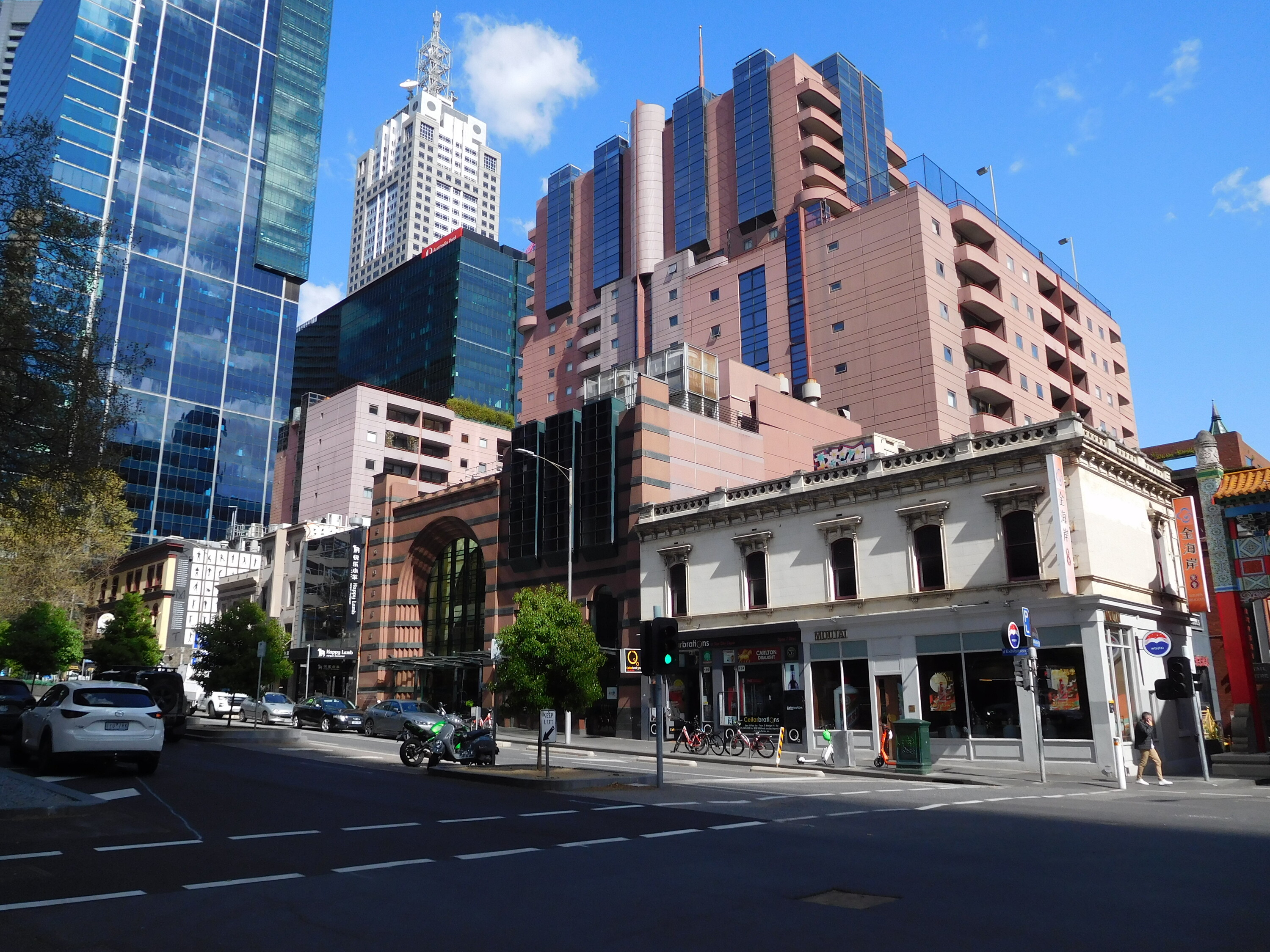
The way the Paramount Centre is set back from the street and wraps around neighbouring buildings on its block makes it feel less mammoth than it looks from a distance. Photograph by author.
Designed by architect-developer Christopher Ng and built by Multiplex in 1996, the Paramount Centre comes five years after the late Fredric Jameson expanded his 1984 essay of the same title into the book Postmodernism, or, The Cultural Logic of Late Capitalism.
For Jameson, the aesthetic preferences of postmodernism are not free from the historical conditions they are embedded within. Postmodernism is not simply a fashion or style, as it might be used these days on Facebook Marketplace posts. It is a cultural logic that is borne from a particular set of capitalistic conditions, specifically those of late capitalism, which describes the transnational flow of capital.
If the Paramount Centre is “iconic” as the agent suggests, it’s not because of fame or reputation. It’s an icon because it captures a set of ideas, values, and styles representative of the time in which it was built.
The site encompassing three frontages on Bourke Street, Exhibition Street, and Little Bourke Street was originally secured by a mix of foreign and local investors. Funding for construction was sourced from Australian, Singaporean, and French banks to develop what constitutes nearly an entire Melbourne CBD block.
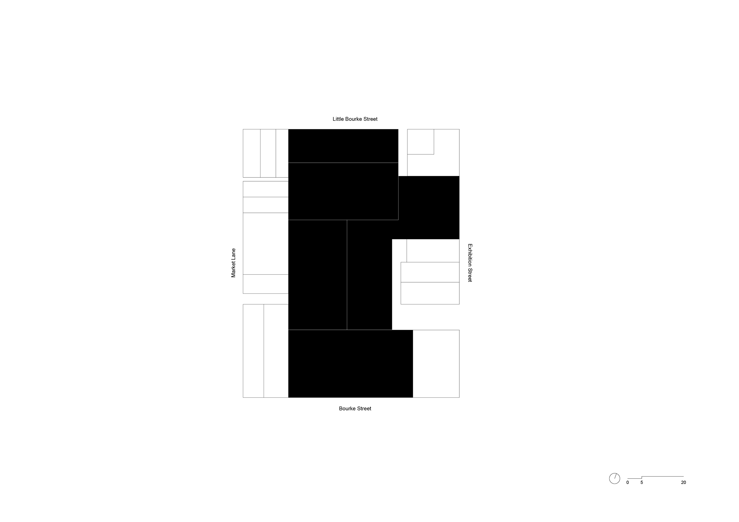
Site plan of the Paramount Centre showing how it hugs nearby buildings on Exhibition Street.
The building’s footprint is larger and its height taller than you might realise from street level. Originally painted in different shades of plum and mulberry to suit the varying light intensities from different aspects, the series of purple-coloured volumes set back from the street contain two-hundred-and-thirty apartments. The development neatly hugs the English-themed pub The Elephant & Wheelbarrow, and a double-storey shop front on the Chinatown side, before increasing incrementally in height. This makes it ambiguous where the complex starts and ends and helps the building integrate with the street context, which is mostly two to three storeys high. At a time when setbacks are hotly contested, The Paramount Centre presents a pretty good case for why they can work.
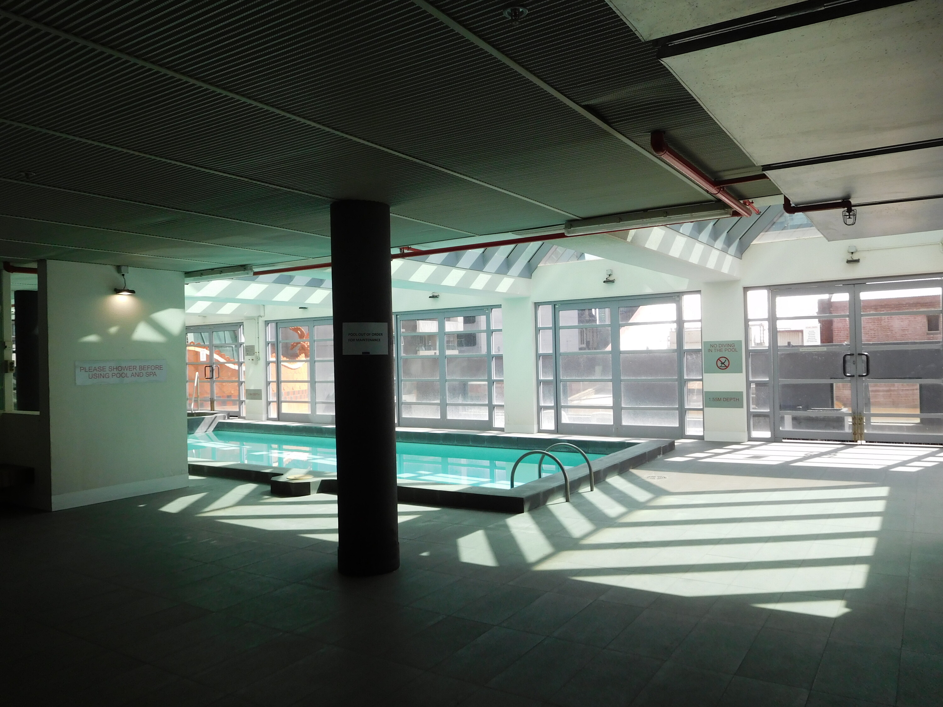
The Paramount Centre’s residential area is serviced by a pool, spa, gym and tennis court. Photograph by author.
Initially home to one of the CBD’s only supermarkets, the Paramount Centre operated like a mini city, with most needs easily fulfilled within the confines of the building. To this day, the private apartments are serviced with rooftop tennis courts, a pool, spa, and gym. It was billed as a place to rival the lifestyles of those in “Paris, Rome, and New York”. At least that’s what this article in The Age says, with the headline “Bourke Street’s lavish castle in the sky.”
This appeal to the northern hemisphere to signal a “luxury” or “aspirational” lifestyle is misplaced. The Paramount Centre apartments really established Melbourne as a place that could offer lifestyles akin to those enjoyed in a city like Singapore, where a family household can live comfortably in the sky.
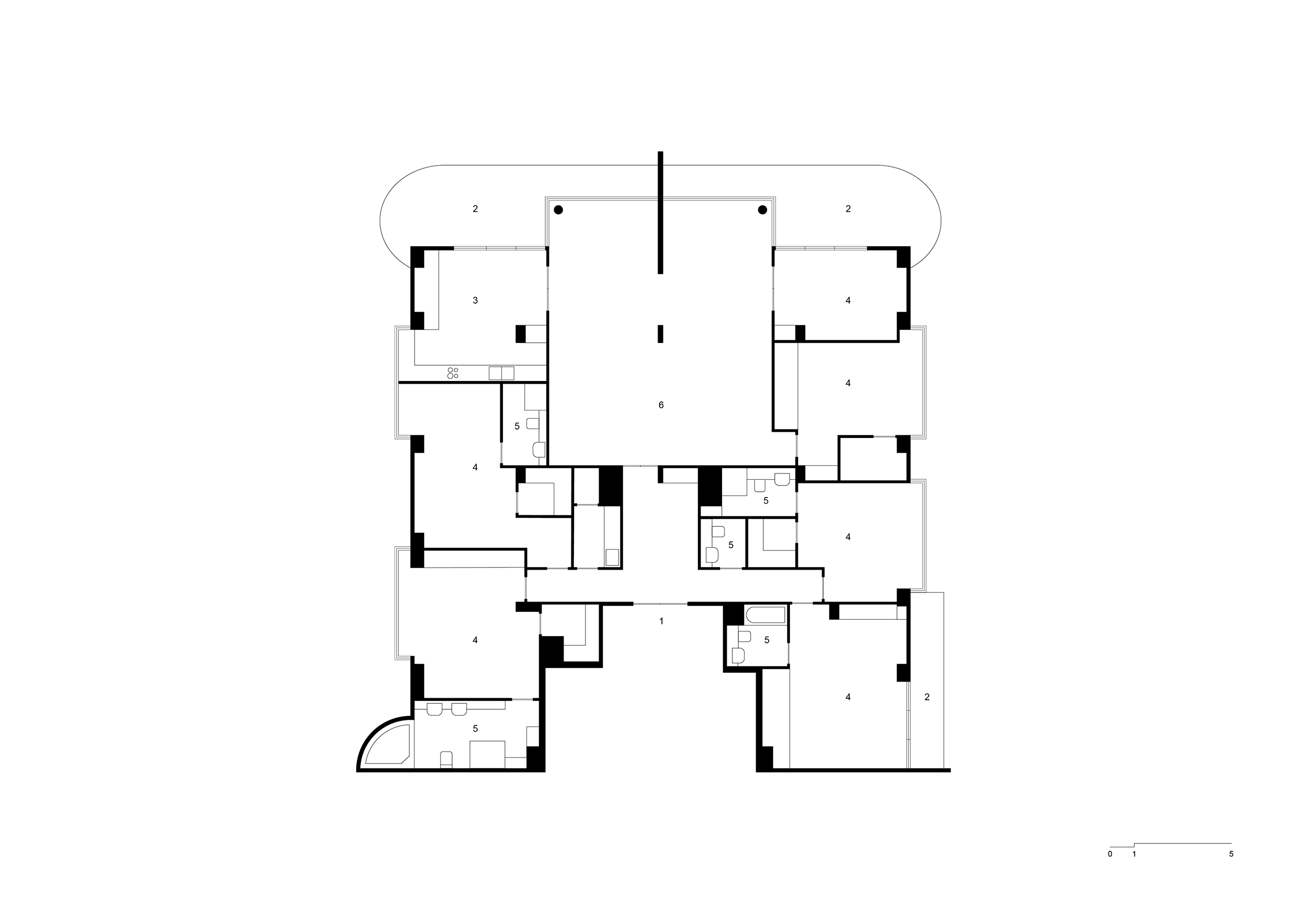
Floorplan of a five-bedroom apartment in The Paramount Centre showing entrance (1), balconies (2), kitchen (3), bedrooms/studies (4), bathrooms (5), and living area (6).
Off the plan, multiple apartments were sold for more than $1 million (not scaled for inflation). Many were soon turned over within a year to fetch profits from Singaporean, Malaysian and local buyers. The apartment I’ve come to inspect is by no means representative of those top-tier penthouses. The one I visit has been empty for at least a month—a surprising amount of time given the conditions of the current rental market.
“I’ve gotten feedback that the fake wall is putting people off,” the real estate agent forewarns me, as we zigzag through the building from one elevator to another.
The “three-bedroom apartment” has dark grey carpet, white plaster walls, and original kitchen appliances. It bears none of the bells and whistles of a space you’d jump at labelling “postmodern” (more on that later).
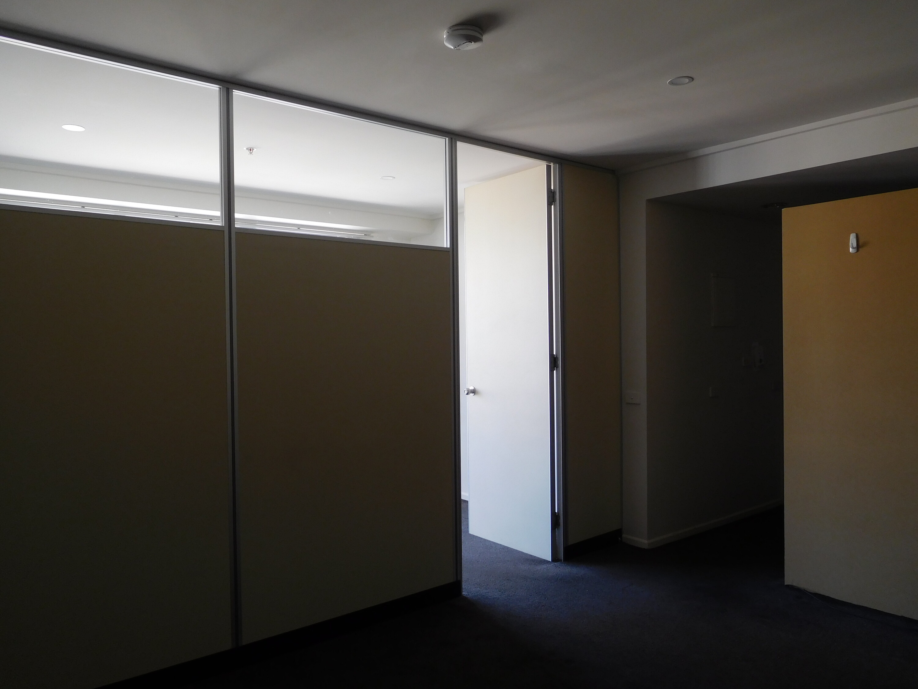
Interior view of the “three-bedroom” apartment available to rent showing the “fake wall”. Photograph by author.
The “fake wall” is a bit of a bummer indeed—it’s a partition office-style wall with small highlight windows at the top. It blocks the majority of west-facing light and divides what was once an open plan living-kitchen-dining area.
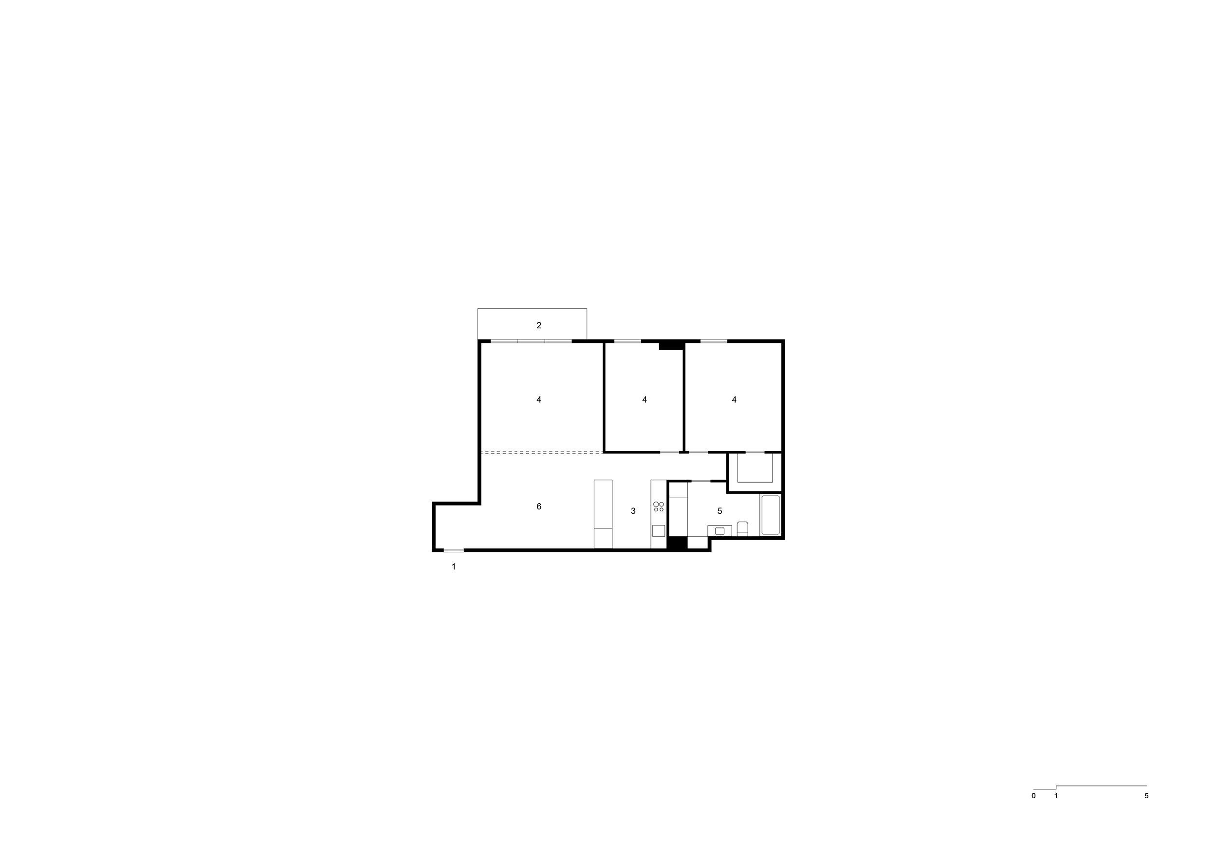
Floorplan of the “three-bedroom apartment” advertised for rent showing entrance (1), balcony (2), kitchen (3), bedrooms/studies (4), bathroom (5), living area (6), and the “fake wall” dotted.
The fact there is enough space in this two-bedroom apartment to generate a newly enclosed area that could genuinely fit a wardrobe, desk and bed makes it clear: this apartment is from a different time period. The original floorplan is generously proportioned in comparison to a “two-bedroom” apartment built today, where there is no way you could feign a third room, perhaps a “study nook” at best.
The additional wall is a good reminder that spaces willingly adapt to the economic conditions of the day. As I look at the partition wall, I wonder if this is a microcosm of the way today’s “housing crisis” is being solved: through a cynical recalculation of space to satisfy a bureaucratic goal of More. Housing. Supply. Thankfully, I turn the opposite way, where I’m distracted by the apartment’s only balcony. It’s a decent view from up here. One that captures Melbourne’s skyline honestly, as a hodgepodge of varying heights and ages.
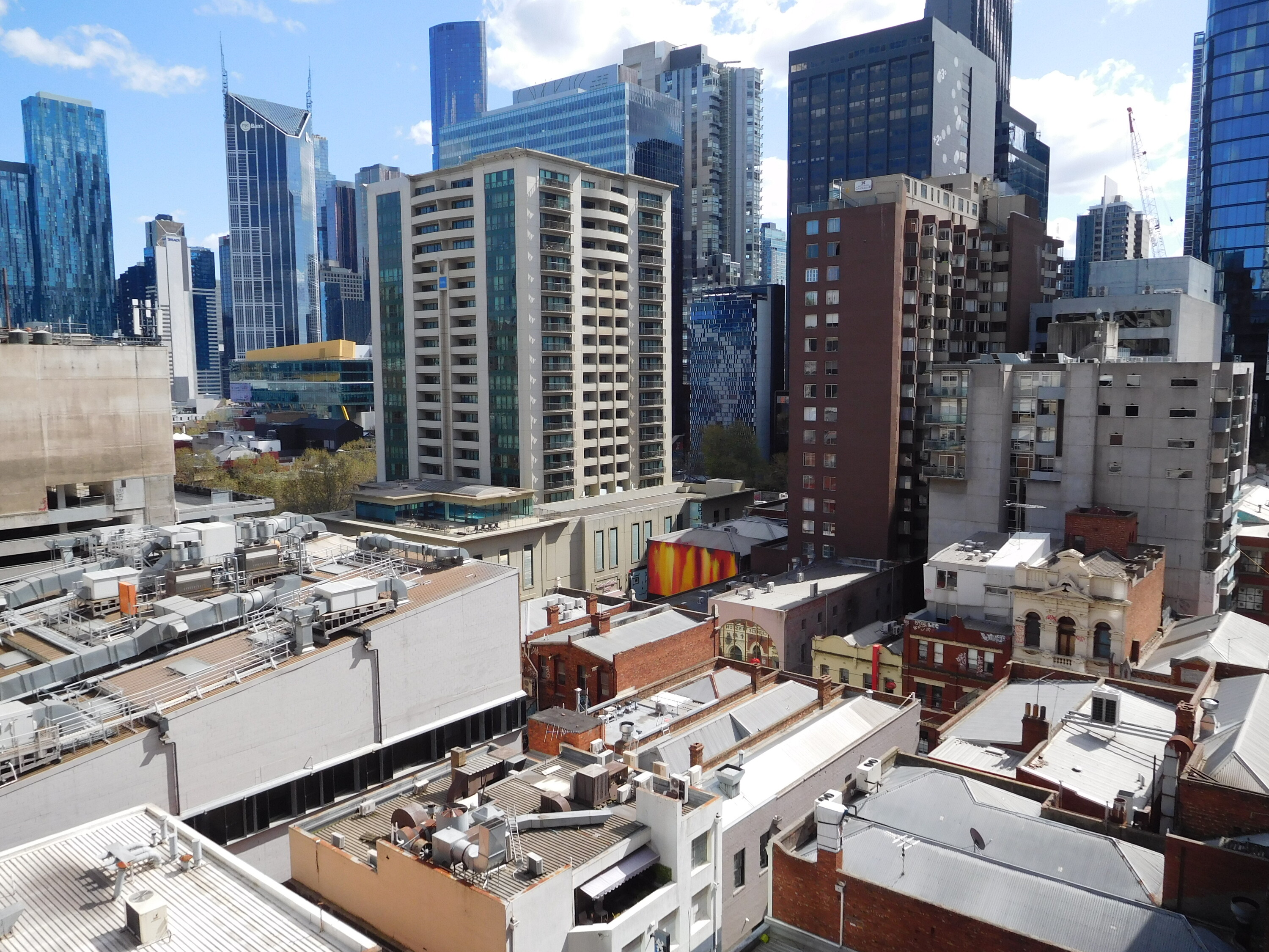
View from the balcony of an apartment on the seventh floor of the Paramount Centre. Photograph by author.
The Paramount Centre isn’t just about its residential floors. Most people nowadays know it for the food court.
Characterised by the faint smell of wok hei, the familiar patter of sparrows, and possibly the best representation of Australian accents across the class and cultural divides of Melbourne, the Paramount Centre’s food court is a place of the people.
White collar and blue collar workers alike take lunch from the variety of fast Asian food offerings mostly served in bain-maries. After 5pm, the crowd morphs into curious tourists and thrifty students keen to down buckets of beer with their Thai fried rice. On some Sunday afternoons, architects even meet here to do two-hour long presentations in front of each other as a perverse form of weekend entertainment.
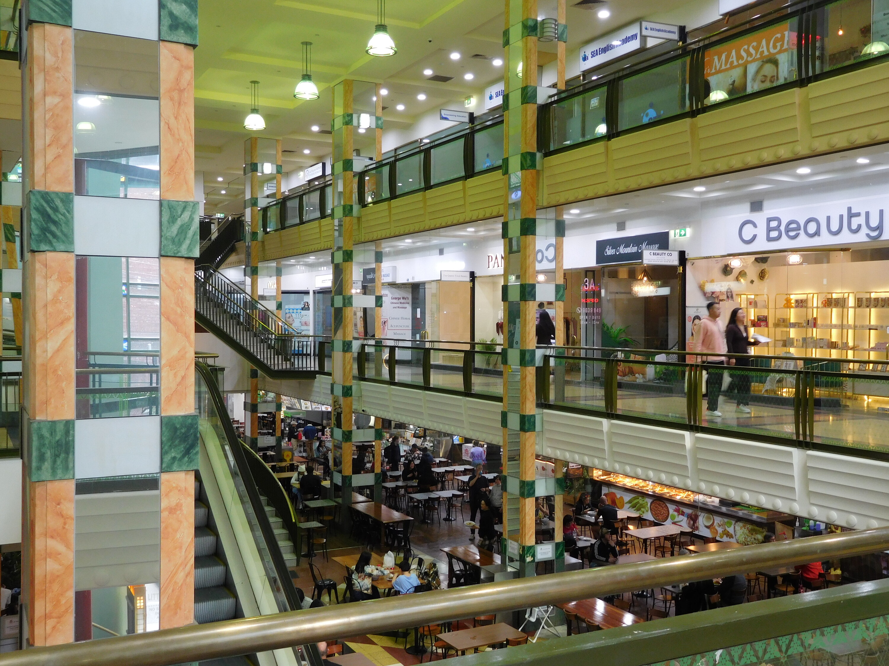
The lower three levels of the Paramount Centre contain retail spaces and the food court. Photograph by author.
Unlike the food courts in the large shopping malls like Melbourne Central and Emporium, this one has no chains. But it’s not just an anti-big corporation stance that unites this food court’s users. According to people on Reddit, the main appeal of the space is its “nostalgic” character. It feels like a perfectly preserved fragment of a 1990s shopping mall that might exist in any part of the USA, or somewhere in southeast Asia.
The way the space melds and cuts across place and time is integral to its “postmodern” character. As Fredric Jameson describes, “with the collapse of the high-modernist ideology of style (…) the producers of culture have nowhere to turn but to the past: the imitation of dead styles, speech through all the masks and voices stored up in the imaginary museum of a now global culture.”
A convoluted mix of references from a range of cultures is contained in the lower retail levels of the Paramount Centre. The space “randomly and without principle but with gusto cannibalises all the architectural styles of the past and combines them in overstimulating ensembles,” says Jameson directly. Take, for example, the clash of materials and patterns that make up the tiled floor, which change throughout the building seemingly at random. Or the faux-bamboo roof of Chine en Paramount, which juts out where the restaurant’s exterior wall turns into the perimeter of the food court.
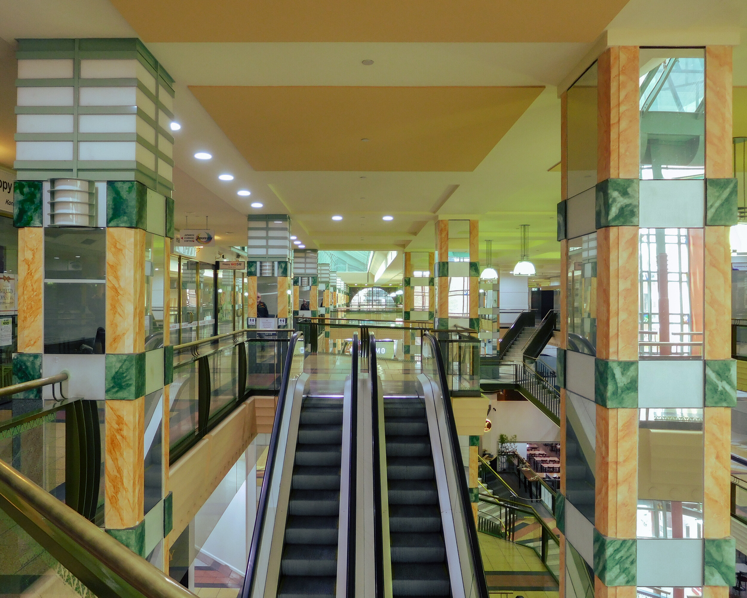
Third floor of the Paramount Centre, on the left side are the lantern columns. Photograph by author.
A good example of the postmodern treatment of materials can also be found in the square columns, appliqued with mirrors edged with orange and green marble, which shift in shape to create rounded edges at various points but from afar appear perfectly square. These columns unify the bottom three floors from the basement to the retail spaces above, while enabling the void in the centre of the food court. Atop some of these columns is a rectangular lantern-style light fitting, drawing attention to how the column works, and bringing into question whether the ones with lights at the top are necessary columns at all, as per the classic postmodern trope.
Similar moments can be found on the exterior of the building. On the Little Bourke Street façade, thin red steel columns are presented as decorative rather than constructive elements, as they seemingly burst out of the glazed exterior wall. Only a few metres away is the retained Edwardian façade from which a terracotta dragon hangs off the ledge of its brick wall, a wink at the mix of “East” and “West” throughout the building, and the combination of time periods embraced by it.
These curious design decisions are just a segment of what adds up to create the building’s identity. The sum total of which is arguably why the Paramount Centre emerges time and again in photo and video content online.
The Paramount Centre is not just a space encountered physically; the food court and retail levels repeatedly appear as a backdrop to music videos, skate videos and fashion shoots. This makes sense from a totally pragmatic perspective—the publicly accessible areas of the building operate like public space. Of course, not true public space, since it is commercial after all, but you could technically sit here without spending any money and nobody would make you move. There is very limited security, and even if there is surveillance, people are often not bothered when others do something a little unusual here. This explains the skate videos to a degree, even if this interpretation undermines the specific attention to detail and aesthetics of this “short film genre”. More obviously though, fashion labels don’t organise a shoot at a location just because security guards don’t patrol the area. So why here?
The Paramount Centre in its mix of stylistic references provides the illusion of being anywhere in the world. In the videos above, the Paramount Centre is not identified in the accompanying captions, which suggests you’re not necessarily supposed to know the video or photo has been shot there.
By contrast, Melbourne Instagram video historians (yes, that’s an accurate description of what these people do) @gardenstatejournal recently produced a short video documenting the Paramount Centre. Here they definitely want you to know it’s Melbourne, because it’s kind of an ad, in collaboration with the City of Melbourne. The Instagram reel presents the space as charming, quaint, and harmoniously multicultural. In many ways, it captures Jameson’s description: “The pastiche of the stereotypical past endows present reality and the openness of present history with the spell and distance of a glossy mirage.” Note that, fifteen years ago, the retail landlords of the Paramount Centre were busted by the ACCC for deceptive conduct, including presenting retail leases as below market-value when they were not, and capitalising on the limited ability of small business owners to speak or read English.
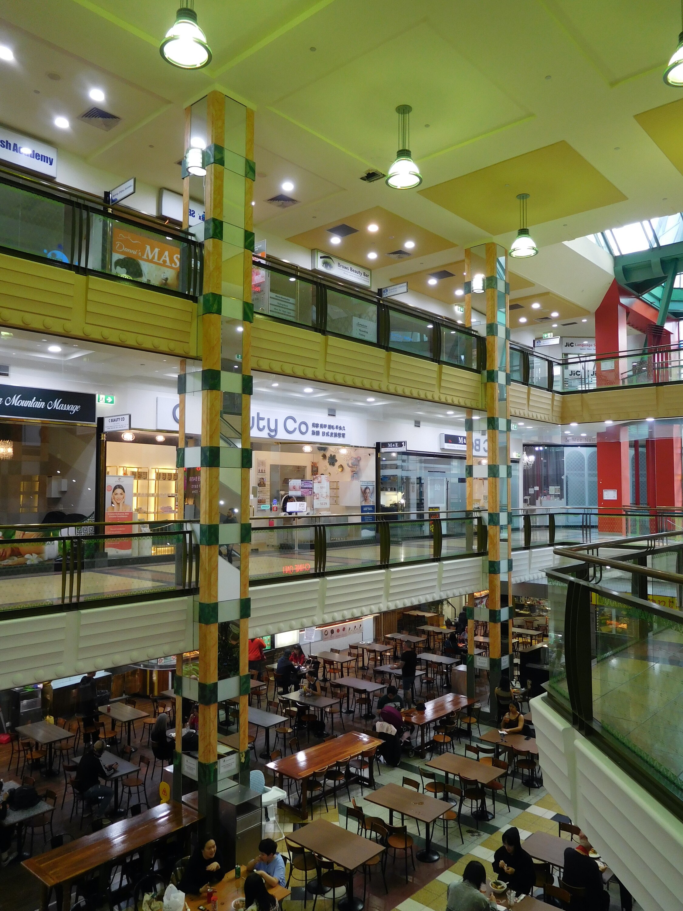
The mirrored columns connect the lower three floors of the Paramount Centre. Photograph by author.
While the Paramount Centre plays a starring background role in photographs and videos, a publicly available record about the building and its design is virtually non-existent. There are no photographs or plans available from the State Library of Victoria dating to when it was built, nor soon afterwards. To get any possible drawings from the City of Melbourne, I’d have to prove ownership of the building in some capacity and pay for the search with no guarantee of what documents could be found. The original builders, Multiplex, told me via phone call and email that they no longer possess any documentation for the building. Intriguingly, my request for drawings was the second one they’d received in a fortnight.
The building is not featured in architectural journals. Instead, the Paramount Centre is found in newspaper clippings. A blog post from hobbyist architectural historian Rohan Storey lays out some of the building’s key features, and his few short lines describing The Paramount Centre are perhaps the most valuable architectural record I’ve come across so far.
The same gap of information applies to the architect himself, Christopher Ng, whose online presence ends after the development of the Nova Stargate building on Franklin Street, a pseudo-apartment-hotel in 2001. Multiple ABN searches, a few phone calls to defunct White Pages listings, and some serious trawling through profile after profile on LinkedIn leaves me no wiser to the architect or his legacy.
What does this apparent gap say? Postmodernism is marked by “pseudohistorical depth, in which the history of aesthetic styles displaces ‘real’ history”—here I quote Jameson again. The Paramount Centre embodies this: it has no true historical record of itself, yet it is captured time and time again for its surface aesthetic value. It appears to simply exist through the green-tinted haze of a screen. From the perspective of today, it helps us view postmodernism as a period, even if it’s also a style.
Madeline Lo-Booth is a writer from Naarm/Melbourne.

