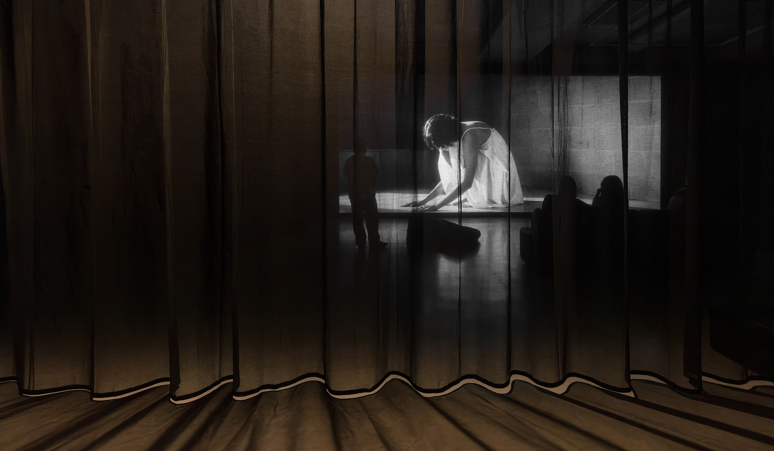
Mount Macedon House
James Bowman Fletcher
I find it hard to read some Australian architectural “reviews” of houses—and not because they are hard to read. I share the suspicion of academic and critic Naomi Stead, who said there was probably never a time without a so-called crisis of Australian architectural criticism. Still, I can’t help but notice that local reviews, especially of houses, seem to belong mostly to the providers and consumers of architectural services—or the architectural industry and its audiences. Local reviews belong much less to anyone interested in architecture (not just the ones consuming its services) and architects (not just the ones providing the services)—something more like the architectural discipline and its audiences.
Maybe this is why what often appears as a local architectural review is just not a review. Well-written words are put next to styled architectural photography, dressing up in “review-criticism” clothes while being quite close to ads or press releases. (Recently, I wrote something that wasn’t only for the industry’s audiences. It was described as an “editorial conundrum,” rewritten by an editor, and published under my name with outstanding edits.) These dressed-up “reviews” are easy to find. They are a strange combination of generic and positive, which is as unfortunate as considering “good” criticism can only be “negative.” These circumstances might be why when I asked Ben Lance (a friend’s brother I’ve met twice) if I could write a review of Mount Macedon House (2019–21) on Dja Dja Wurrung, Taungurung, and Wurundjeri Country, he said he never considered submitting this project to any local mainstream publications. He didn’t think this house had a good chance against their criteria.
There are barriers wrapped up in mainstream publications’ criteria, affecting who and what project has a chance at publication. Those “review-criticism” clothes, which many mainstream publications demand, can price out many architects. Architectural photography can cost up to ten-thousand dollars, while professional styling is increasingly apparent in locally published houses, with the latter on top of the former. (This review uses the architect’s own photographs, some taken with the help of friends, and is not professionally styled.) The fact that publishing in some mainstream publications is financially inaccessible or comes with financial risk is quite bizarre because architects—who are also architectural workers with varied experiences of exploitation—can often occupy a higher-than-average socio-economic position. These barriers would be weakened if publications consistently published a spectrum of costs per square metre (lower costs usually have less of a chance for publication), made costs transparent to contextualise the immovable parameters of projects (this house’s construction cost was about six-hundred-thousand dollars), and a range of experience levels (Ben is young in architectural terms and not widely published).
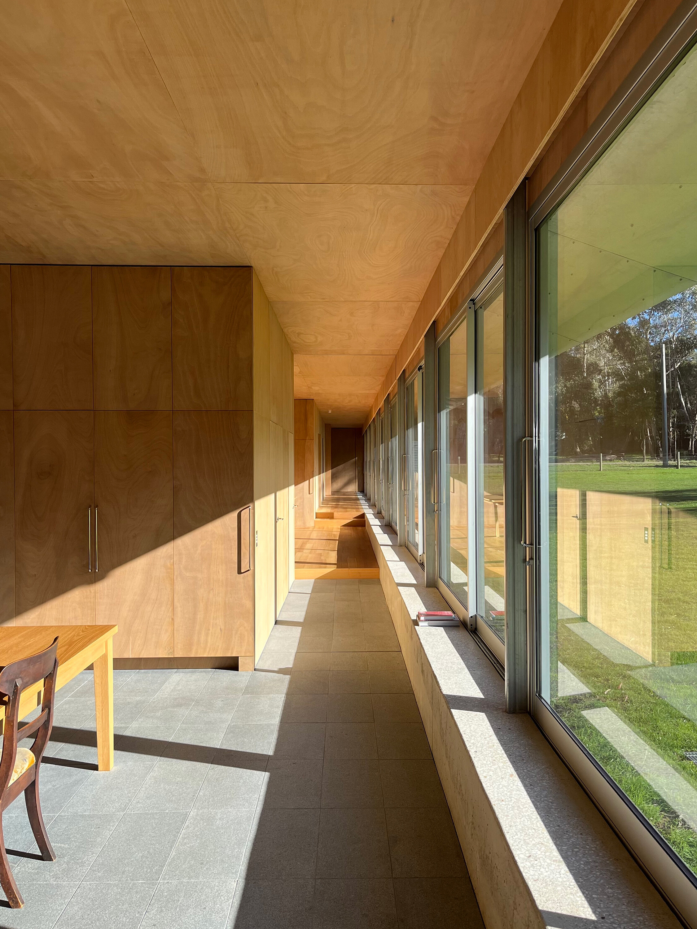
Interior photograph of Mount Macedon House. Courtesy of the architect.
These barriers also filter what is represented as a house by an architect in local mainstream publications. This filtering reinforces a peculiar representation of what an architect does and what architecture is, exacerbating an understanding that houses by architects are mostly high-end with high budgets for high-income clients. That most published houses are high-end, have high budgets, and seem to be for high-income clients creates confusion between cost and quality that is damaging. While publishing becomes inaccessible to some architects, architecture becomes inaccessible to readers. Readers cannot see the architecture that is not this, and what they see is only a particular subset of architecture. With the current high cost of construction increasingly halting projects before they begin on site, this representation is not helpful for readers (consumers and not) and their interactions with architects.
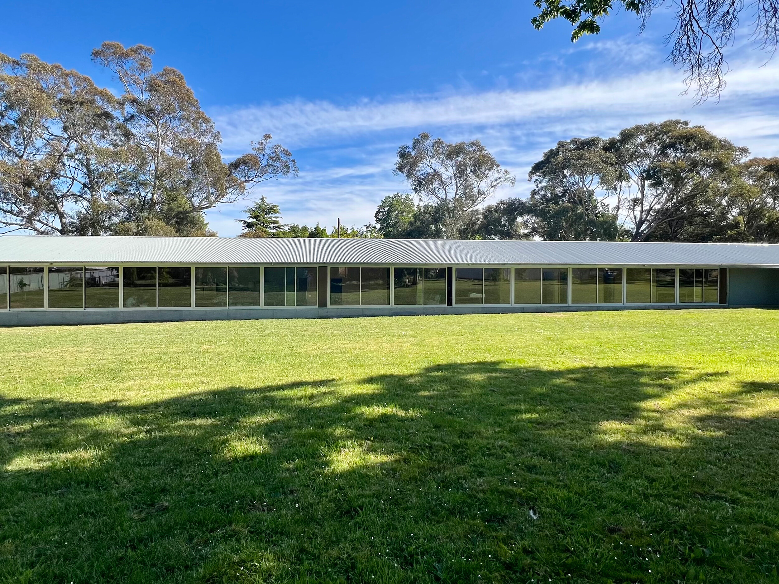
Exterior photograph of Mount Macedon House. Courtesy of the architect.
Like other projects, Mount Macedon House’s chance at publication is also related to the specifics of the project. For example, this work hardly engages with—or “fits”—what local publications seem to expect of a house or what local publications might expect their readers to expect from a house. Instead, this work actually complicates many expectations of a house. I think this is a very good thing, and I worry that many publications don’t include this within their criteria for what is fit for publication. If we want to value a house for what it does to our expectations, not only for how it meets them, we need to make sure this usual “fit” doesn’t get in the way. Amongst mainstream local publications, this usual “fit” seems to be supported and substantiated by two things. Firstly, the you that publications consider the “average” reader to be has no interest in architecture-specific stuff (words, information, and histories related not only to the architectural industry but also the architectural discipline). This is strange on behalf of publications because you (not the you they consider you to be) have already clicked on this and other architectural reviews. Secondly, the “average” occupant conceived by publications seems to be problematically filled with similar assumptions. That is why I’ll drop both of these things for the rest of this review. They are, after all, entirely optional for any review, even of houses.
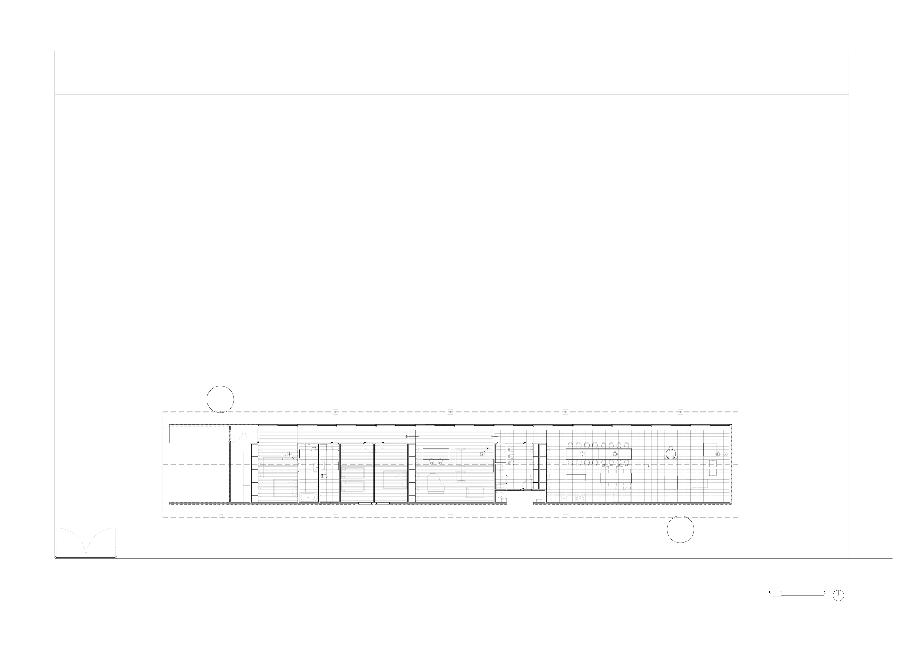
Site plan showing the position of Mount Macedon House on the corner lot with the large area to the north. Courtesy of the architect.
Mount Macedon House is linear, about fifty metres long, runs east-west, and is pushed towards the southern edge of a corner lot. This position leaves an abnormally large area to the north, which will be bordered by trees in the future, making a courtyard of sorts. One visitor was quite worried about what would happen to this area, expecting it to be the neighbouring lot and having something built on it soon. The house is dominated by its gable roof with deep eaves. The eaves are deepened by removing all downpipes, retaining the gutters and drops, and leaving rainwater to fall in midair in concentrated locations from the roof to grates that cover drains in the ground. The roof is clad in corrugated steel sheet, like the rest of the exterior. Twelve equally sized aluminium-framed sliding glass doors and windows run across the entire north elevation and face the area that looks like where another house should go. The roof, the continuous sliding glass doors, items such as a piano and baker’s bench that were relocated and rearranged from the previous house of the client (Kate, who is also Ben’s mother), this large area and its living things are the main parts of the work. The house’s detailing isn’t fussy overall—window frames are not made frameless, and there is no integrated fridge. When there is some focused fuss, it is to articulate parts as the same, not as different. The soffits (the underside of those deep eaves) and facia (the sides of those deep eaves) are clad in one folded piece of steel sheet, making the eaves and roof more like one integrated thing instead of a series of separate things.
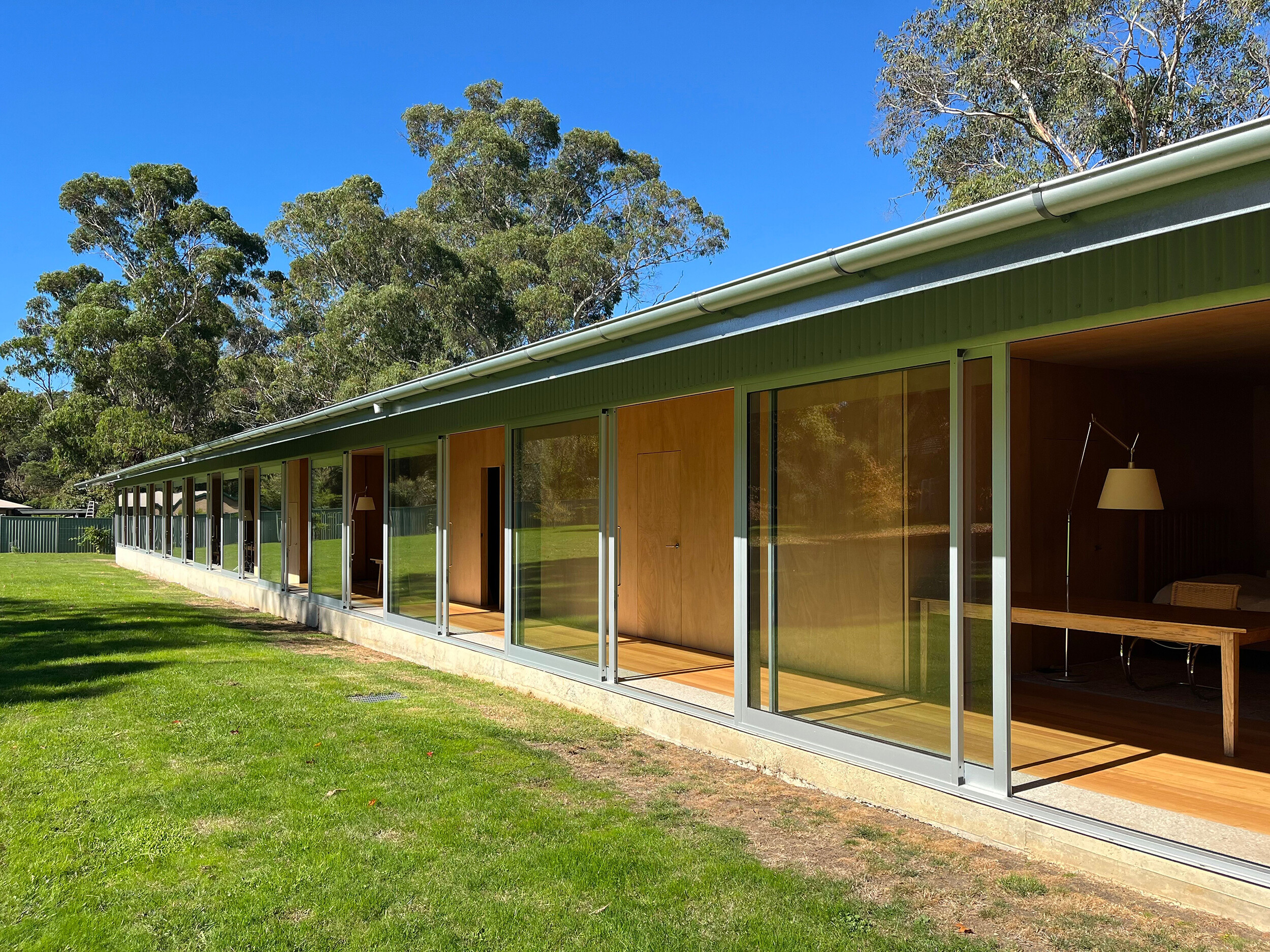
The twelve aluminium-framed sliding glass doors of Mount Macedon House shown open. Courtesy of the architect.
The house is highly considered, but it does not immediately or superficially display a level of complexity or intricacy. It is not easy to point to multiple different bits and pieces that are overtly legible as plural, multiple, or diverse. Most of the ceilings and joinery are the same as most of the walls, and the project is dominated by rectilinear geometry. There are only a few floor finishes, external materials, and just one window frame system. This could be why other visitors to the house told me it was so “simple.” If you already can’t shake purity, asceticism, boredom, Marie Kondo, or Japandi, we might need to look harder to find a suitable architectural context for the work.
Ben told me that reading the Japanese publication GA Houses, tracing its drawings, front to back, as an architecture student, and spending time in Japan was formative for him, alongside a deep respect for local contexts. GA Houses is not the predictable niche-theory-heavy-bottom-up-transdisciplinary publication architects typically single out to a reviewer. Aware of this, Ben reiterated the ongoing importance of the houses in this publication to his work—some, not all. A bridge between local work and Japanese work isn’t hard to build through the issues available at the library during Ben’s studies. Take issue 75. Glenn Murcutt, who has done one or two linear houses partially like this one, edited this issue overseen by GA founder and publisher Yukio Futagawa. Kate’s own training and architectural interests also influenced student Ben to pick up this publication from the library shelf. This influence is inseparable from Kate’s domestic labour raising Ben as his mother and her ongoing contributions to Ben’s practice, especially with this (also her) house. Japanese architects frequently consider the simplicity stereotype projected onto Japanese architecture (and extended to look-alikes) as a modernist oversimplification of the diversity and complexity of their work. Architectural historian Ari Seligmann emphasises one example in the words of Japanese architect Kisho Kurokawa. This problematic simple stereotype can be weaponised as a contrast when we look at architecture. Looking for clues like how a work lacks varied shapes, extremes of colour, and material finishes and textures is sometimes just not relevant. Some work negotiates complexity differently or actively resists seeming immediately and obviously complicated, just like Mount Macedon House does.
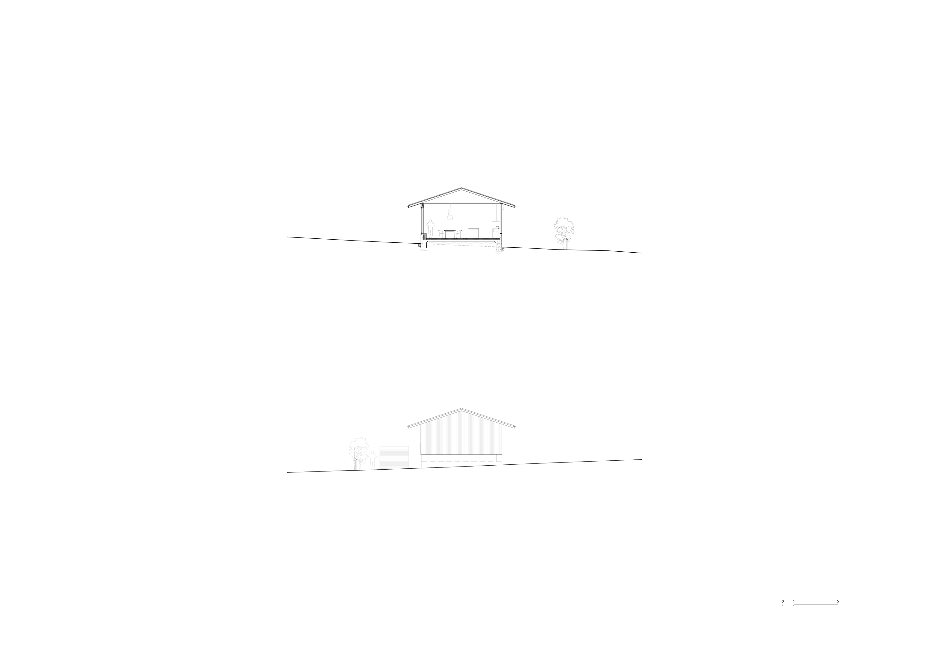
Section (above) and east elevation (below) of Mount Macedon House. Courtesy of the architect.
When I called up Ben to talk about the work, he emphasised that invention was not something he prioritises, which is another source of how the house complicates expectations. The house was designed and built mostly according to regional material and labour processes, such as those related to the production and installation of corrugated sheet cladding, timber stud framing, and poured concrete. This should not be misread as a romanticisation of the shed or an appeal to the bucolic, even considering the house’s gable roof and shed-like construction. Instead, accepting and engaging with these conventions, not inventions, is what leads to the work being less expected on several fronts to different audiences. Delivery drivers often call Kate and say the address has taken them to a factory or warehouse; it doesn’t look like what they expect a house to look like. Kate’s friends, visiting the fully furnished house for the first time, were worried that she had run out of money part way through construction; it looked too sparse and unfinished for a house. When I visited with others who had not been to the house before, it was debated while we parked if this could possibly be the architect-designed house we were looking for; the house does not look “inventive.” If an architect works on a house that does not meet these expectations, if we cannot immediately see the authorship and presence of that expected architect, then what do they do?
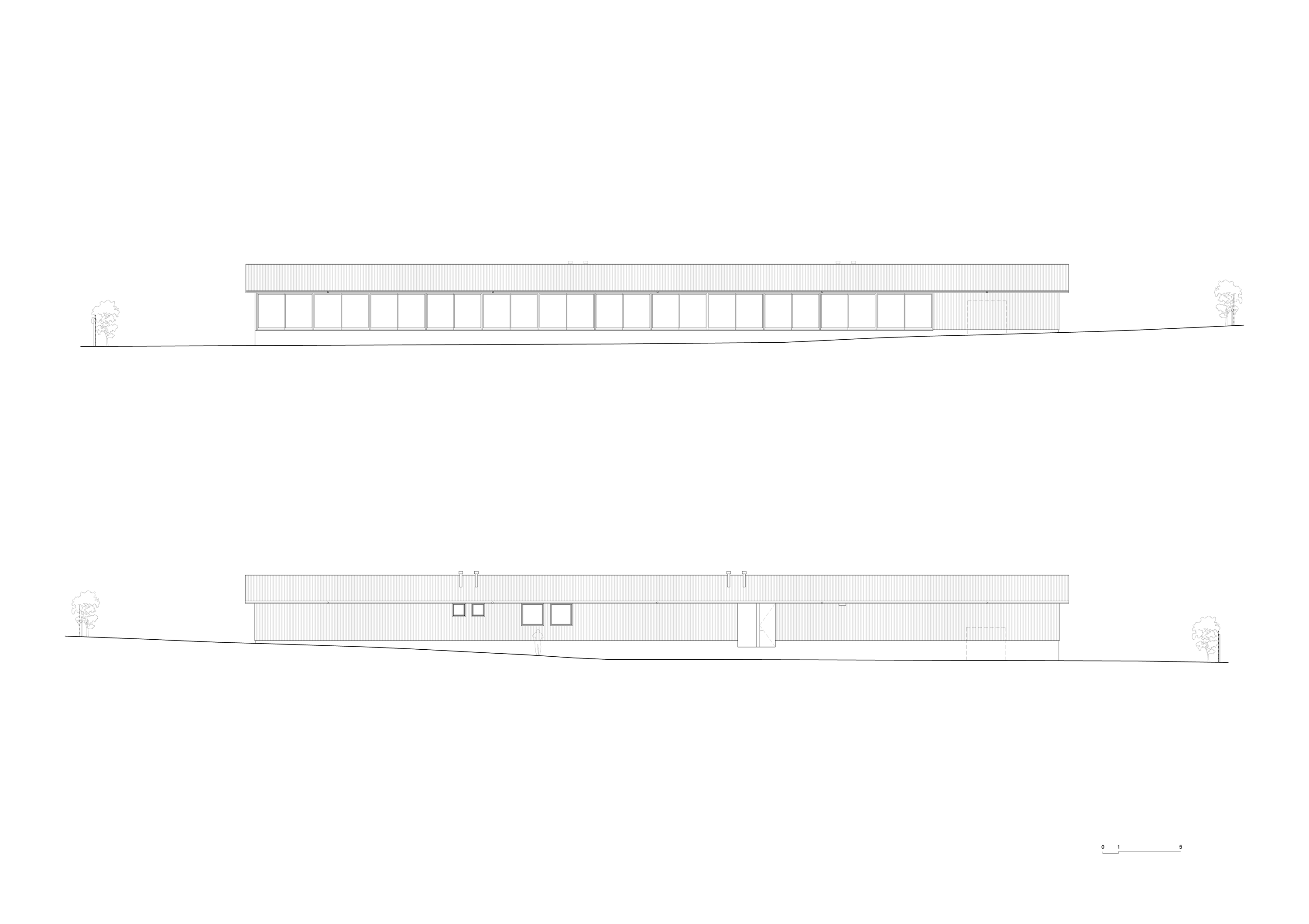
North elevation (above) and south elevation (below) of Mount Macedon House. Courtesy of the architect.
Remember, this house is not yours. The work is not for you. Kate is the occupant and collaborator, not you. If we approach houses with only the baggage of what we expect from a house, residential architecture can only ever be how much it fits to you. Kate is clear about the way she wants to live. Like anyone considered specifically, she decimates the “average” occupant, market-derived or not, which is not to say the house is only for her. There could be some risk in this (maybe), but many people could live here. Engaging with a house without putting you in the house and making it your house is entirely possible. One of the many ways to do this is to engage with a house for what it does to what we expect from a house.
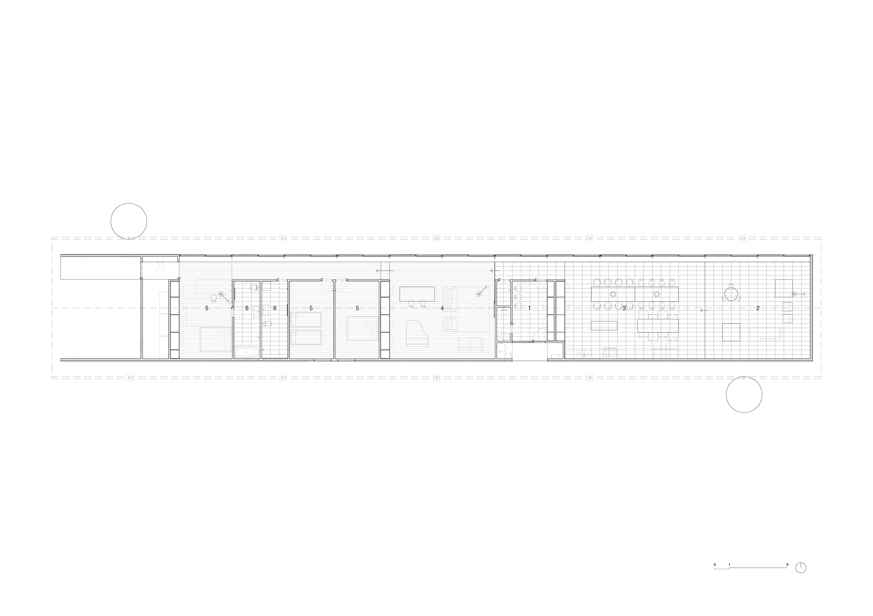
Plan with the entry room (1), living room (2), kitchen/dining room (3), sitting room (4), bedrooms (5), and bathrooms (6) annotated. Courtesy of the architect with annotations added by the author.
The entrance on the southern side of the house takes you to an entry room without any windows, except one near the door. After you pass through this room, you are in what is almost one large room that makes up most of the interior and includes the “living room,” “kitchen/dining room,” “sitting room,” and a “bedroom.” From light (outside) to dark (entry room) and to light (larger room) is a sequence you do not experience in a Victorian or Edwardian house or through a typical hallway entrance. Smaller rooms are arranged within this one larger room, including bathrooms and bedrooms. The smaller rooms are darker, relate to the southern elevation, like the entry room, and they make parts of the larger room corridor-like, with sliding doors available to partition the larger room into the separate rooms of “living,” “kitchen/dining,” “sitting,” and “bedroom.” All other doors in the house are swing doors and open in both directions (180 degrees). This leads to questions from guests when they first use a bathroom, which have no glass shower screens or changes in levels between the ground and shower.
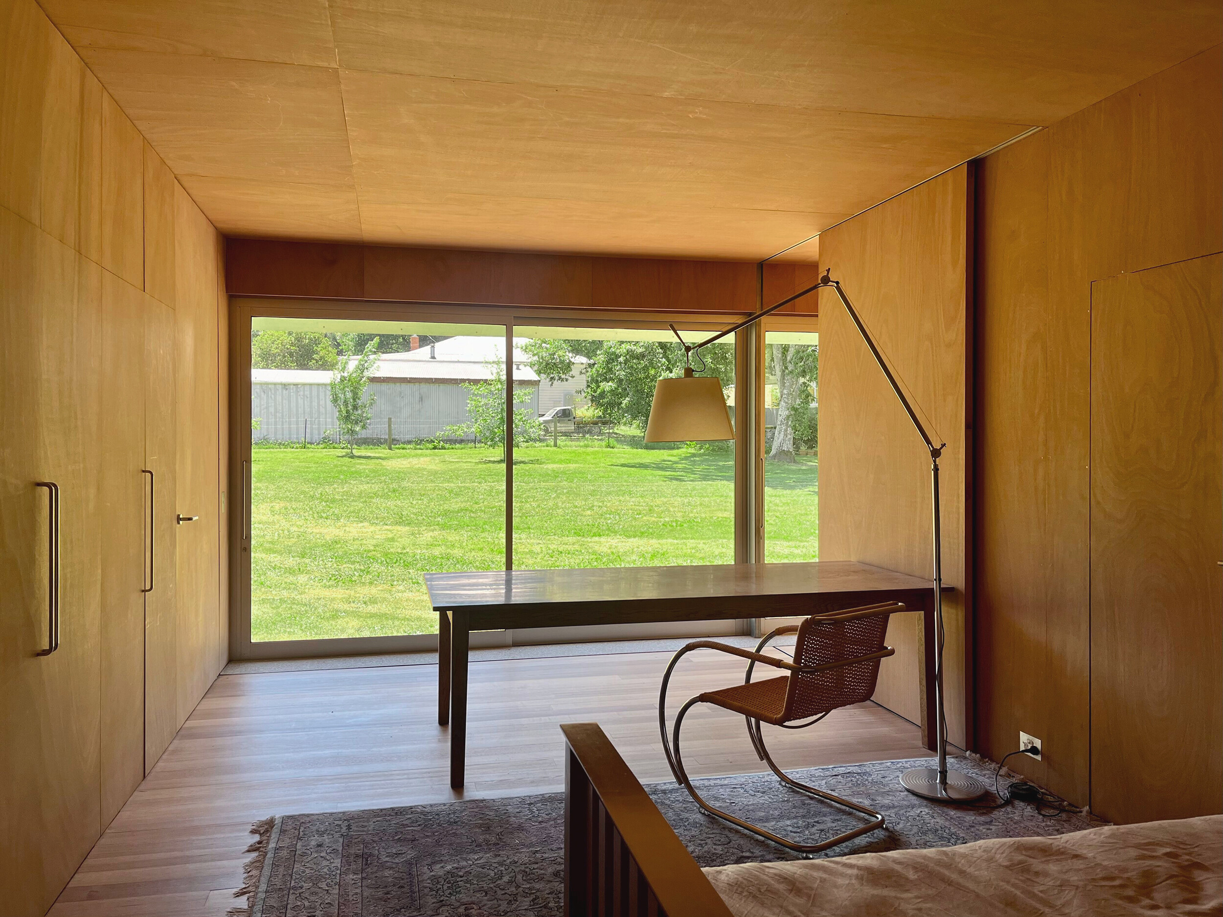
Interior photograph showing the “bedroom” that is almost part of the larger room. Courtesy of the architect.
The arrangement of the smaller rooms within what is almost one larger room means the “living room,” “kitchen/dining room,” “sitting room,” and “bedroom” are how you move through the house. In other words, if the sliding partitions are open, Kate’s “bedroom” is effectively part of the larger room. As Robin Evans pointed out in Figures, Doors and Passages (1971), it is historically peculiar that most house plans now have separate rooms with one door connected to one corridor that isn’t a room. (Evans points to the earliest recorded corridor in a house plan from 1661.) The appearance of this non-room corridor marked a historical shift of domestic values from those associated with gregariousness to those burdened by separating ourselves from those we live with. At other times in history, houses just had rooms connected to different rooms through multiple doors. Interruptions and interferences were not interruptions or interferences. They were part of domestic life, just like they are as you move through the one larger room of this house.
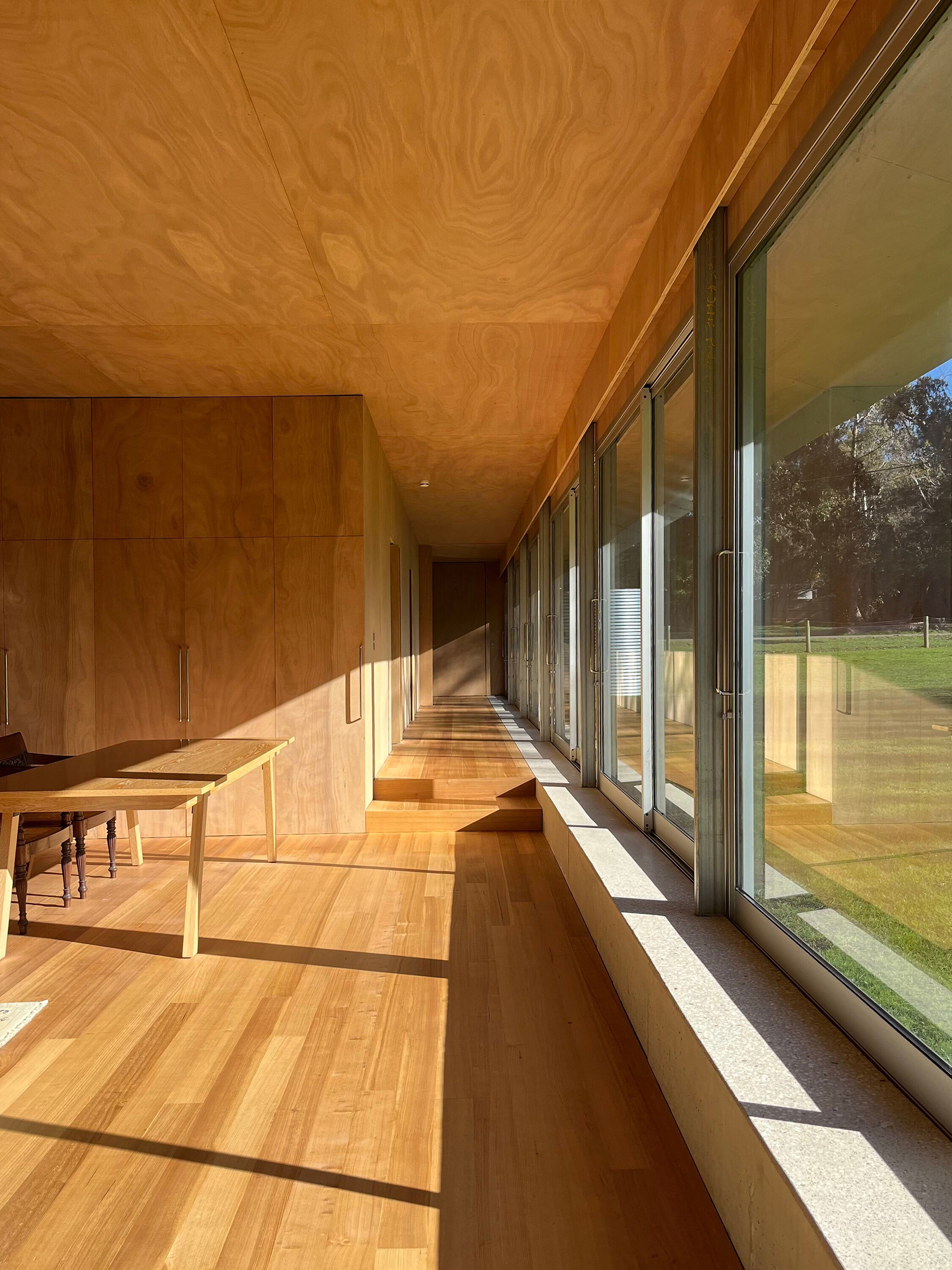
Interior photograph showing the concrete element beneath the sliding doors; the “pelmet” can be seen above them, the floor can be seen stepping up, and the shadow cast by the eaves is visible. Courtesy of the architect.
The whole floor is stepped as you move through the house, following the site’s slope, but not exactly like the trope. A concrete element runs along the bottom of the sliding doors and windows, maintaining a consistent level, like the roof and eaves. These consistencies, curated with the inconsistencies of the floor inside and ground outside, mean that at one end of the house, the concrete element is higher than a seat; at the other, it is the same level as the floor inside. At different points along the concrete element, passing through any of the twelve doors, you have a different relationship with the ground outside and the floor inside—sometimes you step, sometimes you jump. This consistency-inconsistency also means that the ceilings are lower at one end of the interior (as the floor raises and is timber) and higher at the other (as the floor lowers and is tiled). The consistent sliding doors, windows, and eaves mean that a shadow is almost always tracking the sun throughout the day inside. This is something like how the gutters without downpipes make you aware of the rain. If you open all twelve sliding doors, this is exacerbated even further. You seem less inside, or not just inside. Ben spent a lot of time designing a way to hide the proposed blinds (a “pelmet”) for the sliding doors and windows. Before the blinds were installed, Kate realised how much they would get in the way of everything on either side of the glass (what is, more or less, inside and outside). She decided the blinds should never be installed, but the pelmet was kept. This means a white-faced heron often follows Kate as she moves through the house, sometimes tapping lightly on the glass. On most visits, a human friend of Kate’s suggestively recommends a local curtain and blind company. Installing those blinds would put a lot of us at ease by fulfilling our expectations of a house. However, doing so would also obstruct the white-faced heron and Kate’s interactions, which are more likely because these expectations remain unfulfilled.
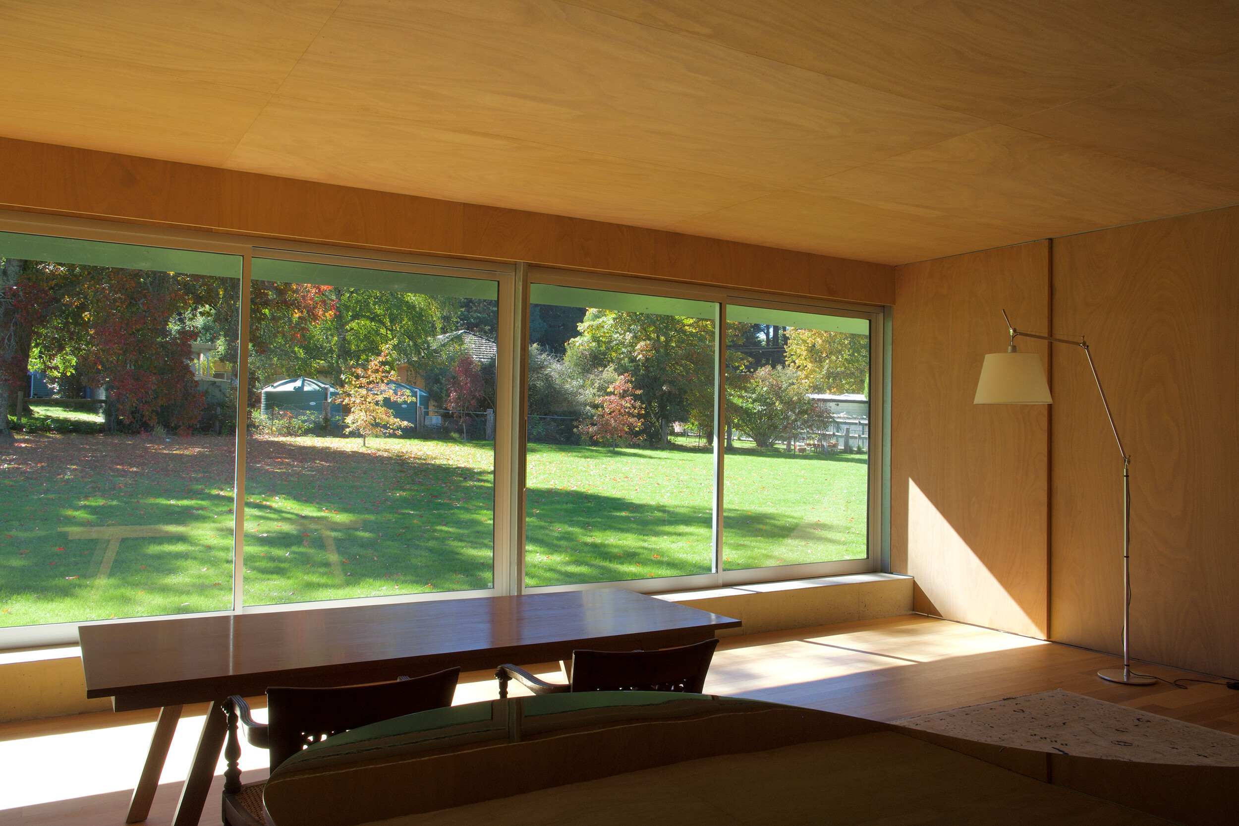
Interior photograph showing the “sitting room” (a sliding partition can be seen closed here). Courtesy of the architect.
Complicating our expectations is something that is productive and beneficial, and it’s why the “fit” of architectural publications should actively avoid neutralising architectural work. The task is to develop ways to represent work (even more unexpected, strange, odd, marginal, and unconventional than this one) so it is accessible and interesting to different audiences, not just an approximate-architecture-consumer-you. This is also why assuming a reader cannot access architectural stuff can actually support another kind of exclusivity than the one it claims to avoid. Whenever a house complicates our expectations, as this one does, it helps us review our houses, not just one house.
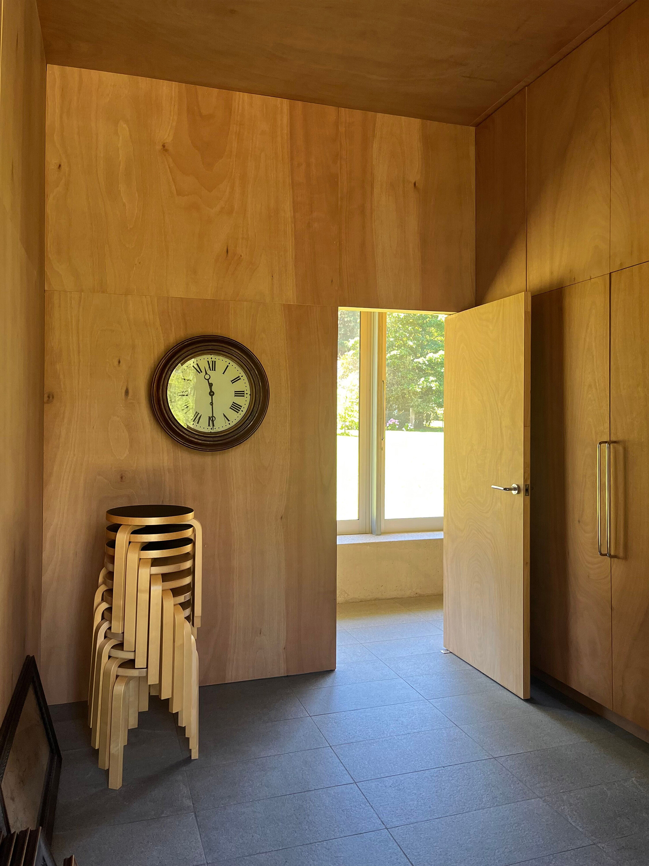
Interior photograph of the “entry room.” Courtesy of the architect.
Ben has, quite recently, decided to submit this house to several local publications. Let’s see how they respond.
James Bowman Fletcher is a practising architect, lecturer in the Department of Architecture at Monash University, and contributing editor of Memo Architecture.

