A Case of the Old and New; Recent Tendencies in Women’s Painting, Melbourne (I) + (II)
Rex Butler
There was a wonderful moment at the 2017 Gareth Sansom retrospective at NGV Australia when, during his floor talk, Sansom described the making of Sweeney Agonistes (2005), the work he painted in memory of his friend Sweeney Reed, who took his own life in 1979.
In Sansom’s painting, a large five-metre wide triptych, a strange anthropomorphic creature strides towards a ghost-like shroud atop a crucifix, while to the left a hunched grey-bearded figure stares out unblinkingly at the spectator. The same pink background runs throughout, although it is a slightly different pink in the panel on the left, where it is also broken up by orange and yellow.
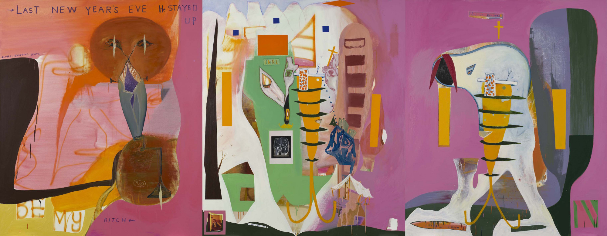
The two right-hand side panels, Sansom explained, had apparently been sitting finished but unsatisfactorily so in his studio until one New Year’s Eve he suddenly realised what needed to be done with them. Working on them uninterruptedly all night and apparently fuelled, so the painting tells us, by drugs where we read there the words “Last New Year’s Eve He Stayed Up Alone Sniffing Amyl”. Sansom painted the third panel to the left to add to the two he had previously made, introducing what might be understood as a witness figure to the tragic events depicted to the right.
But the truly challenging thing, listening to Sansom, who is nothing if not an assured explicator of his work, was trying to imagine what he thought he had accomplished by adding that third panel. It was certainly not any compositional clarity: there is no obvious connection between the three panels, no symmetry between the two ends. The various moments of the painting—the striding figure to the right, the shrouded figure in the middle and the witness figure to the left—all somehow exist unrelatedly without forming any coherent narrative.
Then it hit me. That was exactly what Sansom was seeking to accomplish: this feeling of absolute non-relation between the different parts of the painting. And that what was wrong with the original diptych was not so much that it was wrong as that it was too right. Sansom had lapsed into a style, a manner. There was too much resonance between the whites, purples and thin yellow rectangles. That grey shadow to the right of the figure paired too easily with the scaffold of the cross.
Now the various parts of the canvas add up to nothing: no dream, no metaphor, no allegory. There is only an empty neutrality or indifference, a stunned or poised frozenness that is perhaps some equivalent to what Sansom as that witness figure to the left felt recalling his friend Reed.
At the beginning of Sansom’s retrospective, there was a room full of his early Francis Bacon imitations: He Sees Himself (1964), One of Us Must Know (1966) and The Great Democracy (1968). But he soon moves from the look of Bacon to Bacon’s logic. It is what Gilles Deleuze speaks of, a certain “unclasping” or “withdrawal”, in which “an immense space-time unites all things, but only by introducing between them the distance of a Sahara, the centuries of an aeon”.
And actually, I’d want to suggest, it is absolutely Bacon who is the defining artist of the most advanced “aesthetic” of our age: the sculptures of Isa Genzken and Rachel Harrison; the architecture of Frank Gehry and Eric Moss; the fashion of Rei Kawakubo and Alexander McQueen. It consists of the attempt to produce works whose various parts bear absolutely no relation to each other. It is an art that has no style and no history because it cannot be repeated and embodies no consistent principle from work to work.
It’s a little like a juggler trying to keep all of their balls afloat in the air at once, with each new moment in the work at once impossible and inexorable because there is only one choice that can be made each time that would avoid all association with what comes before. It is a path very difficult to maintain and very easy to fall from, as Bacon understood when he spoke of the image as a “kind of tightrope between what is called figuration and abstraction”.
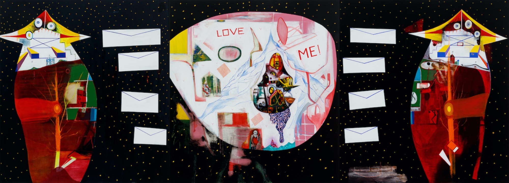
Sansom is at it again in his recent show at STATION, A Case of the Old and the New. In his online talk for the show he points out that many of the works were made by painting over old ones he was not happy with—not so much because they were unresolved but because they were too well resolved.
Once more he takes this up with regard to a large triptych Guardians of the Galaxy (2020), which this time features two sentinel-like creatures on either side of what is meant to be a galaxy or universe, with a flutter of white envelopes running between them. In his talk, Sansom reveals that this time he began with the figure on the left-hand side, then added the one on the right. And only finally, the universe in the middle with its collage of early photos of Sansom cross-dressing and the words “LOVE ME!” in pink capitals.
It’s all beautifully narrated by Sansom and I would urge any young artist to listen to it as a lesson in discipline and perseverance. But there is only one thing wrong: this time the final result is a little too resolved, a little too finished, a little too accomplished. The two guardians on either side of the painting, for all of their gentle swaying, are a little too symmetrical. In fact, altogether they are a little too reminiscent of the Jackson Pollock pre-drip Guardians of the Secret (1943), which also features two sentinel-like figures on either side of a central panel, although the absolutely art-literate Sansom does not mention this in his talk.
Perhaps in his old age after some sixty years of painting and exhibiting Sansom is finally falling into a manner, finding it increasingly difficult not to follow the expectations built up over a lifetime of practice. The juggler’s balls are finally coming down to land.
We can see it in such works in the show—which goes back to 1981—as The Dissertation (2020), I Walked with a Zombie (2020) and D + D (2020), in which we no longer have the indifferent juxtaposition of parts but subtle harmonies and hidden echoes. Sansom is admittedly a million miles ahead of most relatively recent Australian painters. The only ones I’d say who stand in comparison to him are Ian Fairweather, Emily Kngwarreye and Juan Davila. But he is entering a late style, which, paradoxically, is not that doing away with of a manner that occurs to most artists, but the final acquiring of one.
Where to now? Where else might we see this painterly problematic, which is perhaps the defining one of today? At the independent gallery Guzzler in September there was the wonderfully ironic exhibition of paintings titled Recent Tendencies in Women’s Painting. Of course, with a title like that you’d be forgiven for thinking it was one of the NGV’s post-#cockfest make-ups or maybe another instalment of ACCA’s half-baked 2016 exhibition Painting. More Painting.
But, no, it was much sharper and more pointed than either of those possibilities. It is just four younger-generation Melbourne women artists (Grace Anderson, Hana Earles, Alethea Everard and Evie Poggioli), and from the beginning there is an absolute refusal to play wise and offer any representation either of women or of painting in general. However, for all of that, it’s one of the most revealing shows I’ve seen of late concerning the state of contemporary art.
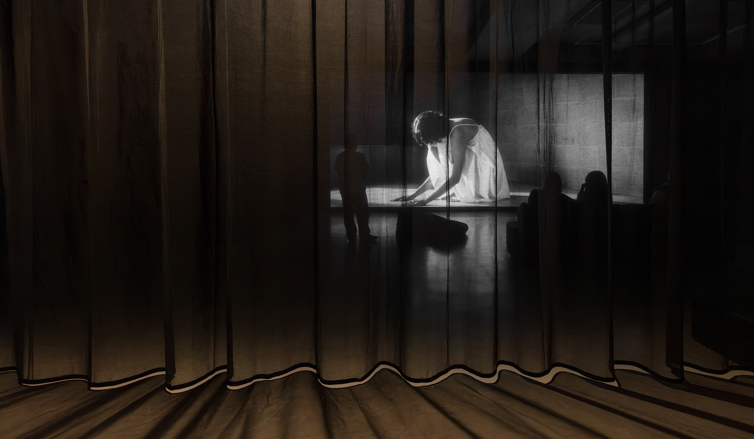
The exhibition was held in two parts, I’m guessing absolutely nobody actually got to see it in person. It exists only in a series of desultory gallery installation shots and interviews with the artists conducted by Guzzler co-founders David Homewood and Alex Vivian. Here’s an excerpt from one of them involving Grace Anderson:
GA: What r u up to this arve?
AV: I just did my washing, had a smoothie and was gonna go out for a walk in a bit.
GA: Omg health goth. Love it. Self care 101.
AV: Indeed.
GA: (laughs).
AV: Kinda self care but just trying to stop eating junk and roast meat and gravy every night,
GA: That’s amazing. You guys cook roasts a lot.
AV: It’s meat galore. No readily available animal denied!
GA: How’s your acid levels? Must be why you’re feeling so productive.
AV: I think the Monster and V is why I’m so productive to be honest. Joking.
GA: You intellectual! I like a Mother… And a competitive bmx racer. Jaz has a bmx ramp in her backyard. She goes on it in her wheelchair.
AV: Really? The hotted up wheelchair.
GA: Yes!
Actually, I could read stuff like this forever in my current post-lockdown state of mind. It’s just so witty, refined and self-conscious. It reminds me of one of Molière’s comedies or maybe the court of Louis XVI as imagined by Sofia Coppola’s Marie Antoinette (2006).
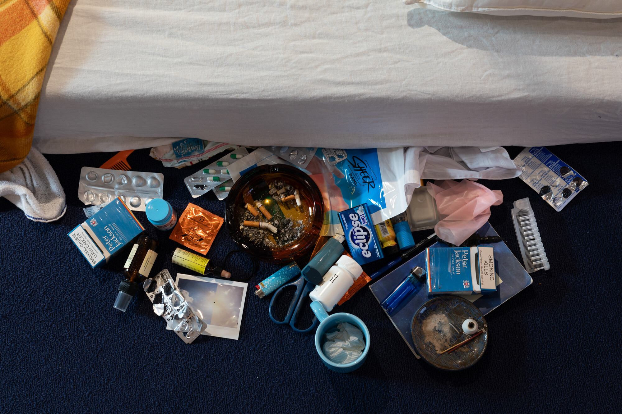
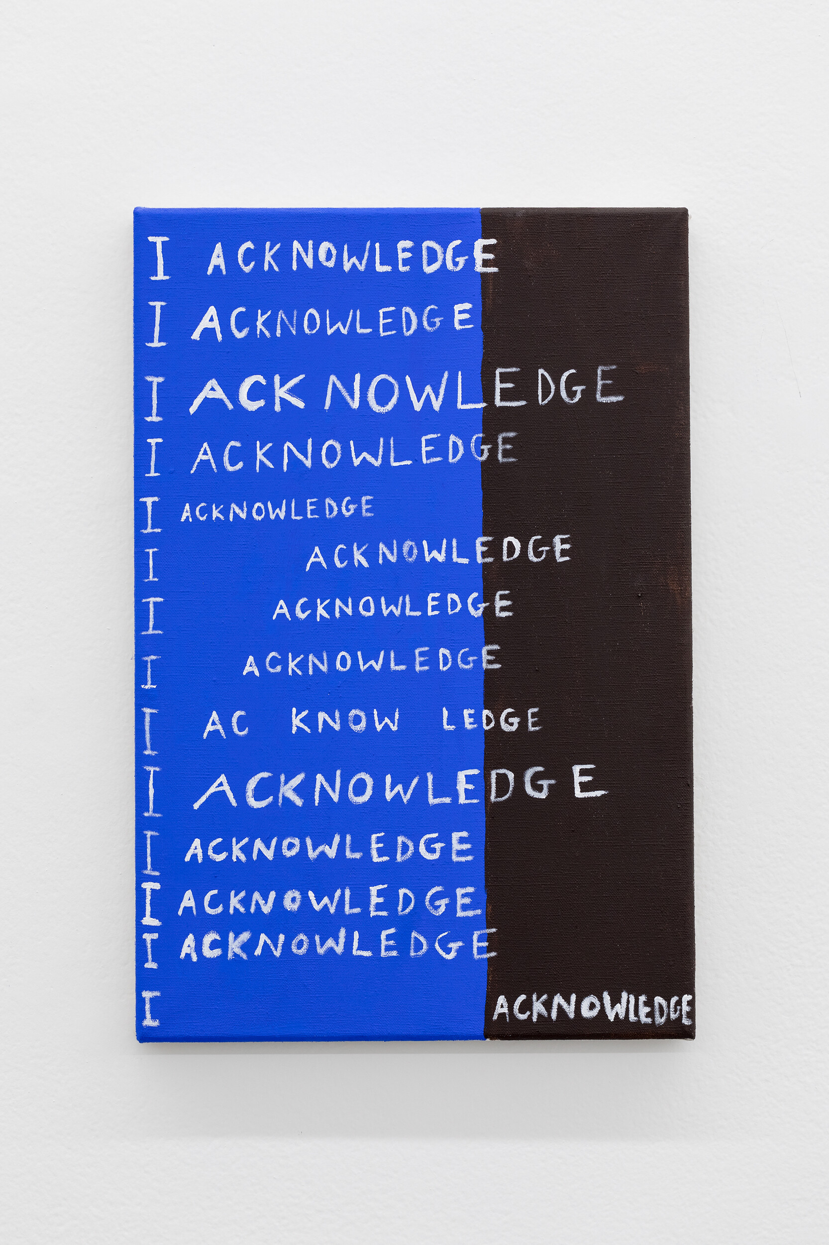
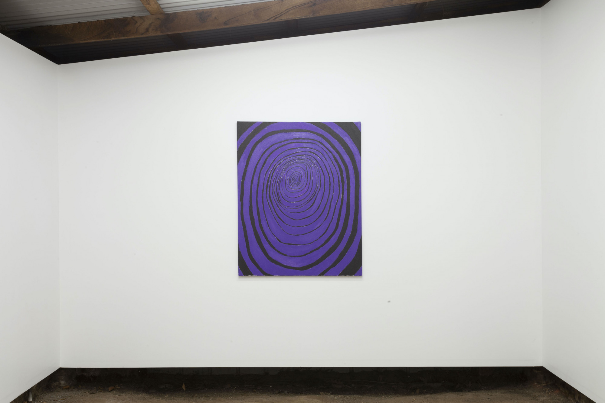
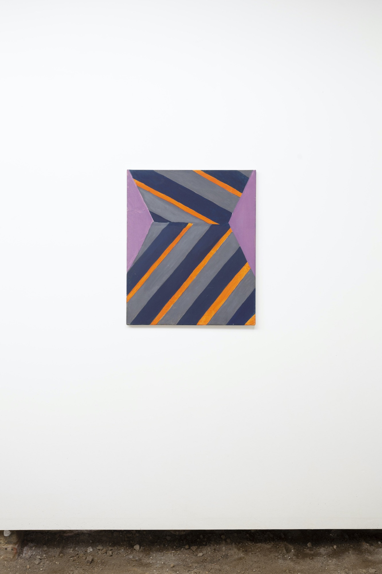
And the art in the show is just as magnificently mannered: desultory, tossed off, careless. There is Hana Earles’ Bruce Earles (2020), a small stripe painting based on one of her father’s bad-taste ties. There is Evie Poggioli’s Untitled (2017), a purple and black cartoon whirlpool. There is Alethea Everard’s 598 Spencer Street 2020 (2020), a spray-painted version of a spray-painted city wall.
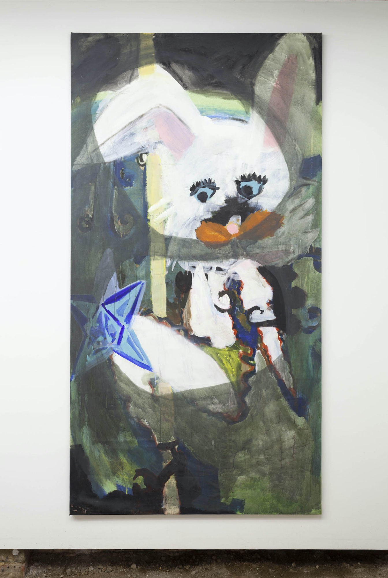
But the artist who caught my eye was Anderson and her Wrench and Handler Wench (2015), a disaggregated black dress, an orange bow and a woman’s body in underwear, and Bunny: I Promise I will Never use Bondisands (2020), featuring a weird rabbit-like creature turning around and showing us its butt, to which a translucent blue star seems to be attached. In fact, maybe Anderson was not the most perfect example of what I was looking for—and nothing could go past Hana Earle’s Chloe Sevigney’s McFeminist Psychiatrist Hospital (2018), which certainly has the best title of any work of art I’ve seen this year—but I just had a feeling. I went browsing on the internet and came across her website and found what I was looking for. Grace Anderson is a terrific slacker scatter artist.
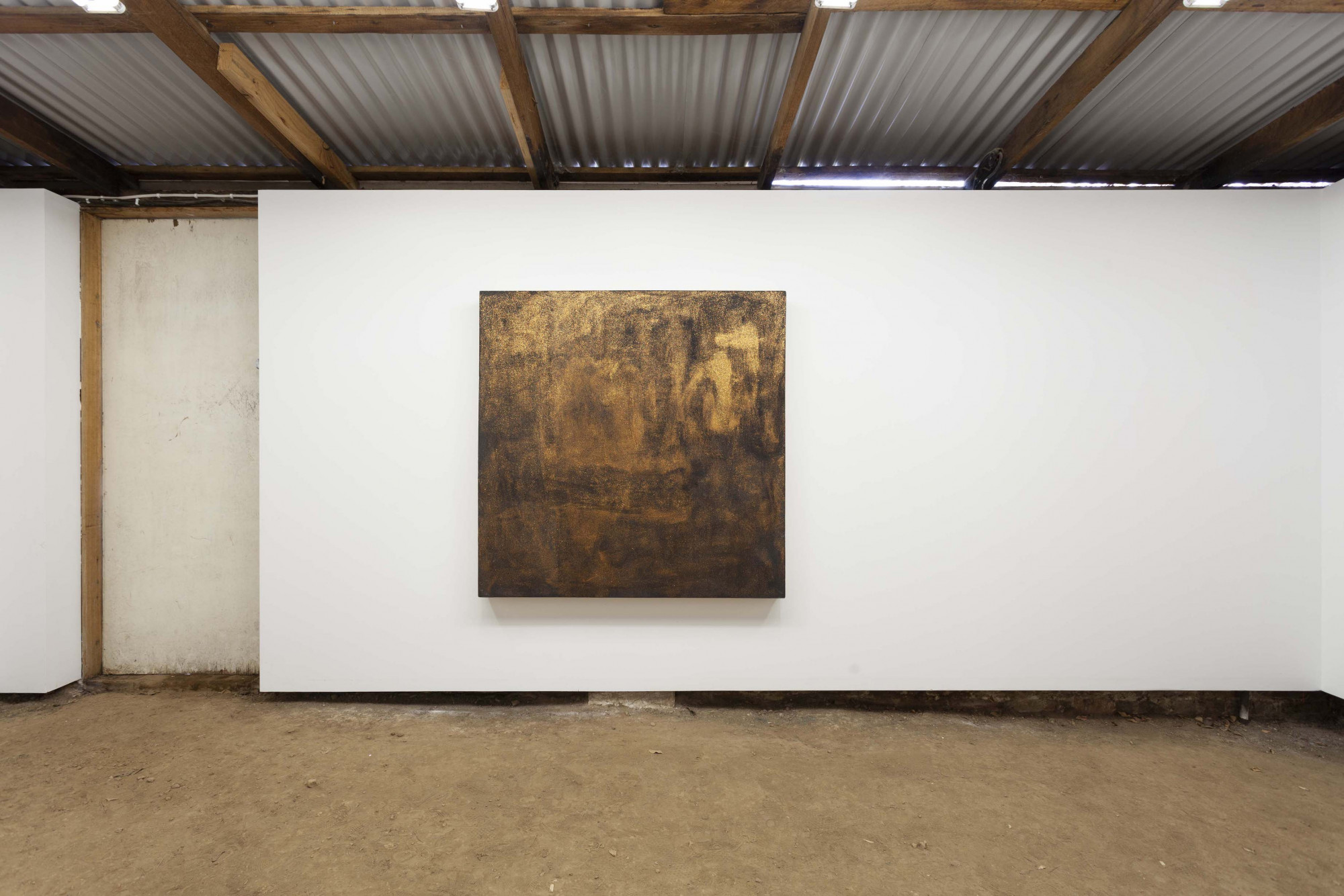
Take, for instance, the installation she made for the opening of the Brunswick Sculpture Centre in 2015. We have a bunch of sloppily painted planks of wood either hung from the ceiling or leant against the wall, a little bronze flower on a plinth and a pair of women’s high-heeled boots made of plaster, all mixed in with a bunch of books thrown around the floor by someone else. Or take her 2013 VCA Honours exhibition, in which there are miniature painted lounge chairs, a Hot Wheels racetrack, a kitsch plastic curtain hanging off a clothes line and a small black trampoline that looks like a Malevich leaning on an angle off the floor.
It might look simple, but actually it’s not. The artist has to select and arrange things just so. They can make no sense, form no style. They can evidence no care, no talent, no intention. It’s more difficult than it looks, and most of the time it ends up as exactly the same junk it started off with.
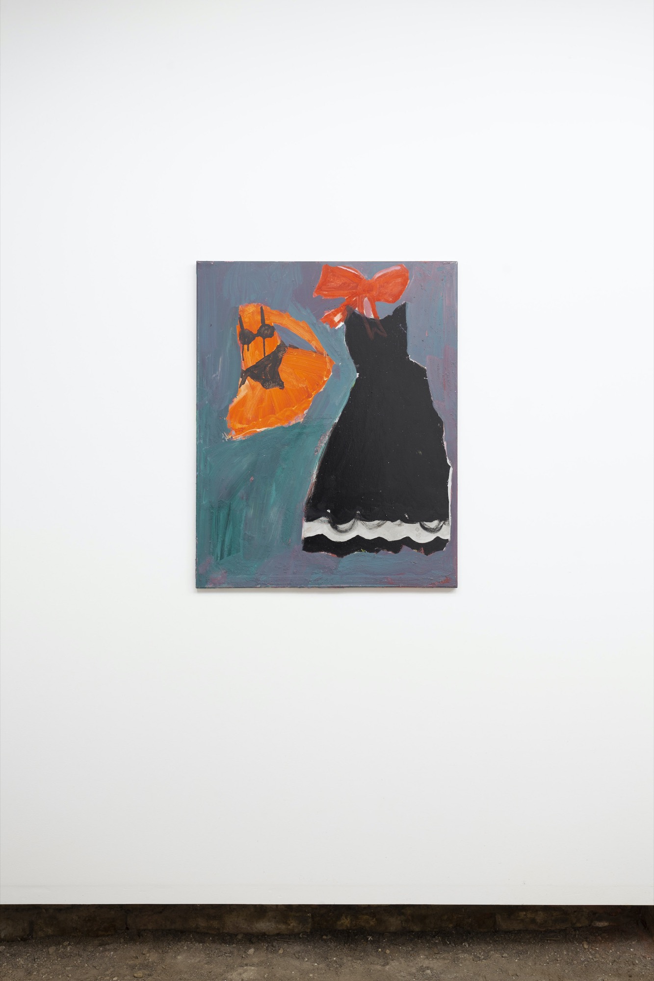
enamel, oil and acrylic on canvas. Courtesy the artist and Guzzler, Melbourne.
But as I looked at Anderson’s work, I kept on thinking of Sansom and the same arduous task of how to keep the various parts of the work away from each other, with at every moment the whole threatening to tip back into style, taste and manner. I kept on seeing the same Baconesque challenge of “withdrawal” or “unclasping”, and in Deleuze’s inimitable words of “making the work stand up on its own”.
It might be put this way: if the balls are finally falling out of the sky for Sansom, for a young artist like Anderson the problem is how to get them up there in the first place. But all of this is to tell us—this is the utter unclassifiability and non-historicisability of Bacon in the history of art—that the only real avant-garde today has no look, no style, comes out of no prior practice and leads precisely nowhere. It is only something frozen mid-air with the artist’s hands working frenziedly underneath.
Rex Butler teaches Art History in the Faculty of Art Design and Architecture at Monash University.
