Melbourne Central Commercial Mural Paintings
Philip Brophy
I’m standing in front of one of the current commercial mural paintings on the Latrobe Street façade of Melbourne Central. It’s a sunny day, and the wall is perfectly lit—the sunlight heightens the mural’s hues and contrast levels, and one can clearly perceive the brushwork’s role in simulating a photo-realist veneer. This mural is an advertisement for the online MMORPG Endwalker – Final Fantasy XIV. Technically, it’s the fourth “expansion pack” in this long running game created and produced by Square Enix in Japan. Executed in acrylic paint, the mural reproduces the handsome and heroic Warrior of Light mid-battle, just as he appears on the cover of the game pack. As is usually the case of PlayStation realist fantasy games, the mural’s originating image bears an identifiable hyper-realism courtesy of the high-end CG air-brushed painterliness which typifies their opening sequences. FF beings like the Warrior of Light are rendered in a visceral meltdown of mimeticism, eroticism and plasticity: he is slick, unreal, post-human. Seeing him effectively de-rendered in wall paint on lightly mottled plastering is disorienting, charming and weirdly intermedial.
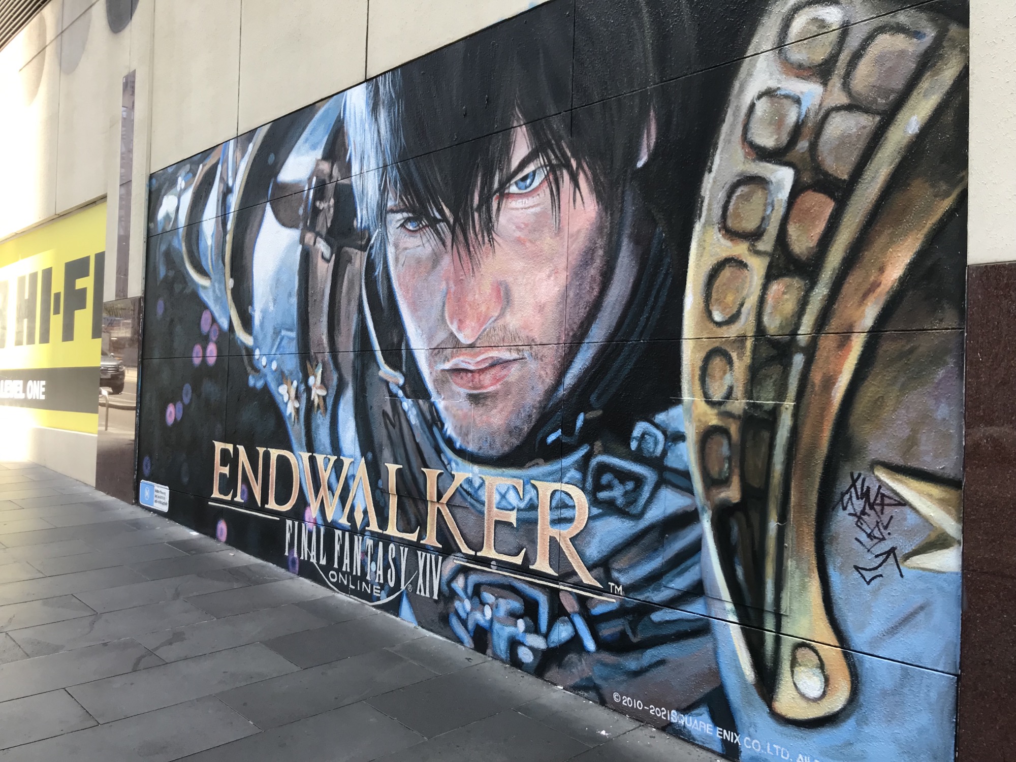
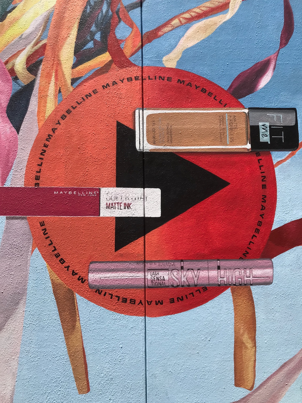
All this and more flashes through my mind as I admire this advertising hoarding, commissioned by JB Hi-Fi and announcing a new must-have in-store item. Gaming tech and content are JB’s main trade. A sign of our fluxional intermedial present is that the store still uses the word “Hi-Fi” when hardly anyone buys music anymore, instead streaming playlists for free through Spotify on crappy WiFi networks that slice-and-dice the signal bouncing onto inadequate monophonic Bluetooth speakers. The word “fidelity” is entirely inappropriate, yet this painting pays lip service to fidelity through representation. JB’s Melbourne Central store is one of many transitory sites they have occupied the CBD over the last decade, nomadically shifting their premises in accordance with the constant price-cutting, format-changing and platform-battling that has made them the city’s most competitive sales front for “technertaiment”. Painted wall signage, then, is a perfect fit for the company’s passing trade. Other murals are on sections further along the concrete wall that lines the pavement edge running between Elizabeth and Swanston Streets: Coca-Cola, Coopers Beer, Maybelline cosmetics and Sony PlayStation are represented with similar painterly reproductions of photographic source images.
They all look great—for many reasons which this review is keen to address. There’s something almost archaeological about their presence. They recall the dazzling consumerist cave paintings from America’s early to mid–twentieth century epochs of billboards, hoardings and murals. Products and people were depicted in these first waves of iconic branding, where objects gleamed, glistened and twinkled—and faces, hands, teeth and eyes hovered like moist, fleshy mirages of sexualized gargantuanism. Photography was neither the source nor the style for these graphically realistic modes, which drew upon the painterly perfection attained by Norman Rockwell et al. It was a period of US advertising that created Pop Art: the latter could not possibly exist without the former. Pop artists were inspired by the phenomenal aura of large-scale projected painterliness, and how the logistical transformation of upscaling intensified both the iconic content of the images as well as the action of intermedial transference. Lichtenstein’s abstraction of comics, Warhol’s appropriation of advertising imagery, Rosenquist’s landscaping of billboards—their differing methodologies meet on this plane of intermedial transference.
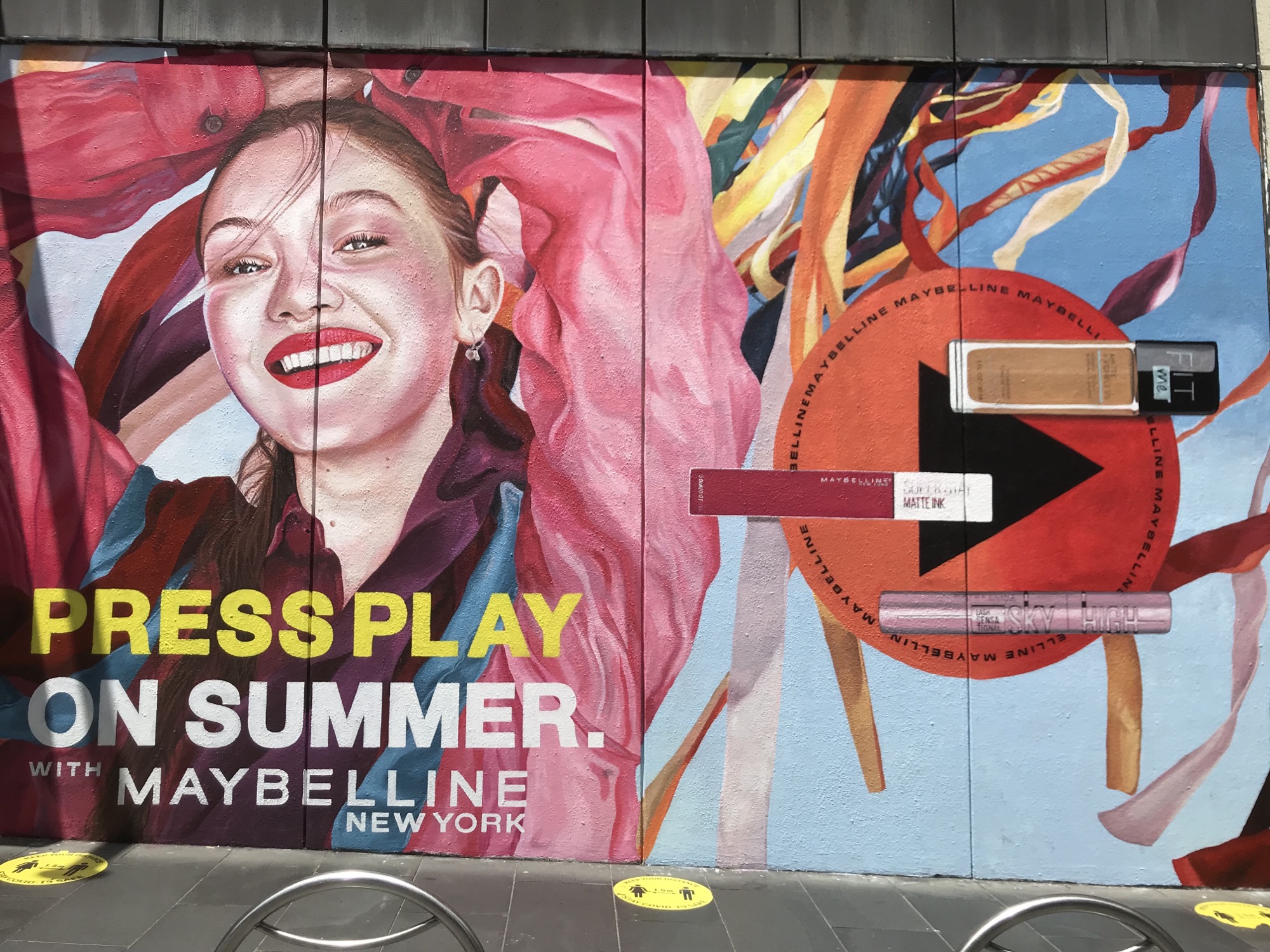
Seeing a hand-painted, photo-realist mural engaged in this type of product deification today is a thrilling throwback to when the art and craft of painting was deployed in the service of creating a living imagescape that waged ocular war with its architectural support: i.e., a period where image (billboards) decimated form (buildings). In fact, this notion can prompt a de-radicalisation of the Insta-venerated deluge of “street art”: it tacitly assumes it is providing “cool” or “beautiful” images to transform otherwise “banal” or “ugly” walls, but all it can ever do—though mostly failing—is emulate the public logistics of commercial outdoor advertising. Latrobe Street is smeared with what amounts to visual vaporwave in harshly lit consumerist sunlight: this is in contrast to Hosier Lane’s numbing insistence on blackfaced Hip Hop and Orientalist kawaii cred. Clearly, I’m more excited by the former. The smiling face of the Maybelline girl flattened into perfection under studio lamps; the icy bottle of Coke set against a blurred background simulating camera focal depth; the Coopers beer cans positioned from inside the fridge looking out into a bright world—just walking down the Latrobe Street block is like promenading a conveyor belt of portals into alternate realities of hyper consumption. We’re not talking about the feigned politicised clap-trap of OMG series like Black Mirror and its take on simulation. Instead, this is the blinding banality of product intervention into one’s navigated space, wherein such images are co-ordinates plotted along our urban perambulations.
Maybe I’m favouring this unfairly. As a local, unavoidably frequenting the CDB’s concentrated commercial zones and developments, I’ve encountered over many years the painting crews toiling away on these murals (which I believe began in earnest around 2005 once Hoyts opened their multiplex at Melbourne Central). They’re a rag-tag bunch, multi-gendered and multi-aged, vaguely Alt, a tattoo here and there, but all wearing paint-splattered jeans and T-shirts, clutching scrappy computer print-outs as they recreate sourced photos through painterly skill and technique. But I’m not being clever-clever in momentarily pondering how this display might be considered a form of contemporary art practice. These painters are momentarily enjoying financial equity, technical practice, creative deployment and public exhibition—albeit on terms antithetical to the tenets and protocols of the myriad policies that govern the parsing of state funding, council energising and community bonding, which Contemporary Art proclaims as being a positivist plan to grow the “creative industries”. I’m surely not alone in thinking that plan sucks. When I watch these wall painters concentrating on their craft, I am excited by the inverse realisation of those utopian government-sanctioned programmes. Supported contemporary artists feel they are somehow zeitgeist-fuelled, politically-justified and professionally-aligned, despite the fact that the content of their work and its statement of identity, commentary and intervention will ultimately fade into nothing. The commercial mural painters, by contrast, have a brief moment in the sun, being artists in a self-immolating spark that places them in flash servitude to corporate brands who could not give a fuck about the identity of the painters in their employ. The more these two “practices” are amorally considered in tandem, the less they are opposed and the more they are simply redistributions of each other.
This is not a theoretical conceit. The question to be asked is: what do you do if you can draw or paint well? What if you are—in the most obviously conservative way—gifted, talented, or skilled in being able to illustrate realistically what you see, either IRL or through photos? When this question is asked in high school, it’s not a problem. You’re too busy drawing all over your text books, scribbling when you should be listening to teachers, doing well in “art class”, uploading drawings to DeviantArt, and maybe even falling into tagging crews and branching out into your own murals. The question gets tougher if you manage to get into “art school”. That’s the Battle Royale between you with your intuitive push towards emulating the masters of painterly technique, against the rest of the class, who might have a bit of drawing skill under their belt, but who have strategically, pragmatically or cunningly decided to ape whatever Contemporary Art favours. They’re the kids who, when they finally get into a group show in some contemporary showcase space, would pay for “third world” painters to do “realistic” oil or acrylic boards for their ironic e-flux post-internet flirtation with “image”. (Consignment-order tapestries cost too much at this stage.) The serious point here, though, is what happens to the art student who can draw and paint well?
The worst outcome is that they are welcomed into the most reactionary forces of the art market: the visually silent majority who just want a good-looking painting in their domestic environment. And there’s nothing wrong with that. But the trafficking of such visual modalities—photo-looking without being hyper-realist; brushy and messy around the edges without resorting to sterile air-brush sheen; multi-layered with either expressionist ticks or “pop culture” graphics so as to collage crafted skill within a panoply of visual codes—contributes to a critical withering of the possibilities that realistic, mimetic and illustrative forms of painting could possibly attain. And this in turn aids in creating a vacuum within Contemporary Art wherein such conservative tropes and stances are studiously avoided, inflating CA’s supposedly radical and oppositional values. No wonder so many illustrative painters have found a reprieve in council-supported “street art”. Those bright /dark /DeviantArt /Pop /Instagram /Banksy /Juxtapoz throw-up CAT projects allow these mural painters to do what they love doing, even though they’re doing work in a dead-end laneway that goes nowhere. While contemporary artists fret over their (ugh) SmartyGrants online submissions for residencies in alternative institutions locating themselves further and further out of the CBD orbit, the inner city mural painters have to professionally face the e-commerce gigosphere of self-hustling and social media identity in order to paint for a living. Again, both options share realities; only their dreams appear to be in conflict.
I might be accused of trolling a bleak view of where art students end up. But it’s so easy to inspire someone to hold on to their dream of succeeding as an artist; it’s much harder to be around for that person when the dream doesn’t pan out. I am wholly sincere in my appreciation of the Latrobe Street murals because I like the fact that these artists are still painting despite all the forces that work against them and assume that their only value as skilled artists (no scare quotes required) is in the commodification of their skills.
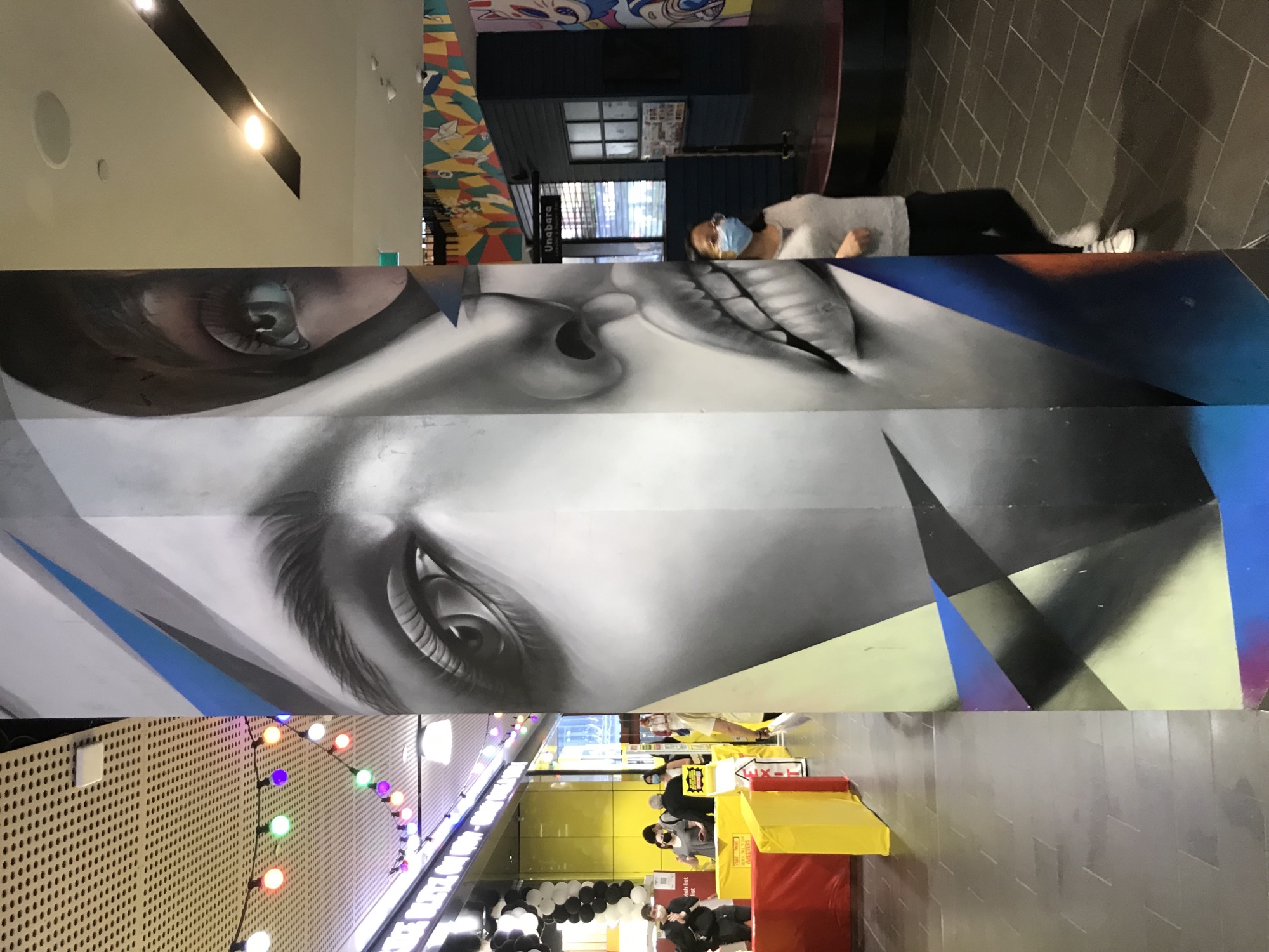
Utilising a long-term perspective, I also think that illustrative skill continues to loop back into our shifting present to destabilise congealed contemporaneity. This is precisely what was theoretically presented—in a half-convincing way—in Douglas Crimp’s 1977 Pictures exhibition, staged in the midst of NYC downtown imported punkdom (and its later expansion for an essay in October in 1979). Illustration was central to the painterly concerns of David Salle, Robert Longo and Jack Goldstein, and the photographic allure of Cindy Sherman, Barbara Kruger and Richard Prince. Their work was effectively about “picturing” and clearly drew upon media generally and advertising specifically. (Most of them at one point allowed their work to “illustrate” an LP cover.) And while those artists undeniably continued to forge distinctive careers over the decades, it should be acknowledged that there was much happening simultaneously elsewhere that was ignored and dismissed in terms of how one might critically re-evaluate or champion “illustration”.
Realist illustration remained strong in the late 1970s, with the long-standing West Coast tradition of post-Pop/outlaw/tattoo-biker-comix image-making, headed by the Boschian delights of Robert Williams and the Hogarthian narratives of Robert Crumb. At a lower cultural level, the diffusion of late 1960s Photo Realism painting was by this stage peaking with the giant airbrushed replicas of LP covers by Elton John, Fleetwood Mac and The Eagles for Tower Records in L.A.. (Both these trajectories would become crucial influences on Street Art in years to come.) And then there was the New York Academy of Art. As the Pictures exhibition opened at Artist’s Space, the NYAA was being formed in TriBeCa as a private school, specialising in technical training for realist painting. Its most famous instructor was Eric Fischl, long held as a rejuvenator of contra-Pop contemplative realism in America (though some regarded him as a “draughtsman” painter due to his figurative practice). The irony of this ideological intersection is that the NYAA was developed as an antidote to the continental contemporaneity of both Beuysian conceptualism, and the expressionistic figuration of Neue Wilde and Transavanguardia, just as the later-dubbed “Pictures Generation” was wielding illustration as a critical tool. The NYAA’s reactionary stance and Crimp’s critical stance were arguably looping into each other.
Throughout the 1980s and into the 1990s, the NYAA also became famous for its society hustle shows: the “TriBeCa Ball”, and the (ahem) “Take Home A Nude” fund-raiser. In the 1995 ball (the same year as the YBA Sensation exhibition toured), young painting graduate Maria Farmer was coerced into selling one of her works at a discount price to one Jeffrey Epstein. She was not the first to be sucked into his dark orbit through the lure of professional networking and sizable commissions, but she was the first to contact authorities and attempt to press charges following his sexual misconduct. The painting of Farmer’s purchased by Epstein was her updated impression of Edgar Degas’ infamous Le Viol (1868–69). Like many of the NYAA graduates, Farmer innocently explored reveries of adolescent sensuality not dissimilar to the themes apparent in Fischl’s work. Realistic figuration is crucial to maintaining the muted erotic energy of such paintings; Epstein interpreted the painting as a ticket for him to “take home a nude”, leading him to troll the NYAA balls for years to come, offering successful graduates “residencies” in his various mansions and retreats where his underage sex trafficking took place (often under the pretence that he was auditioning models for the annual Victoria’s Secret catalogues).
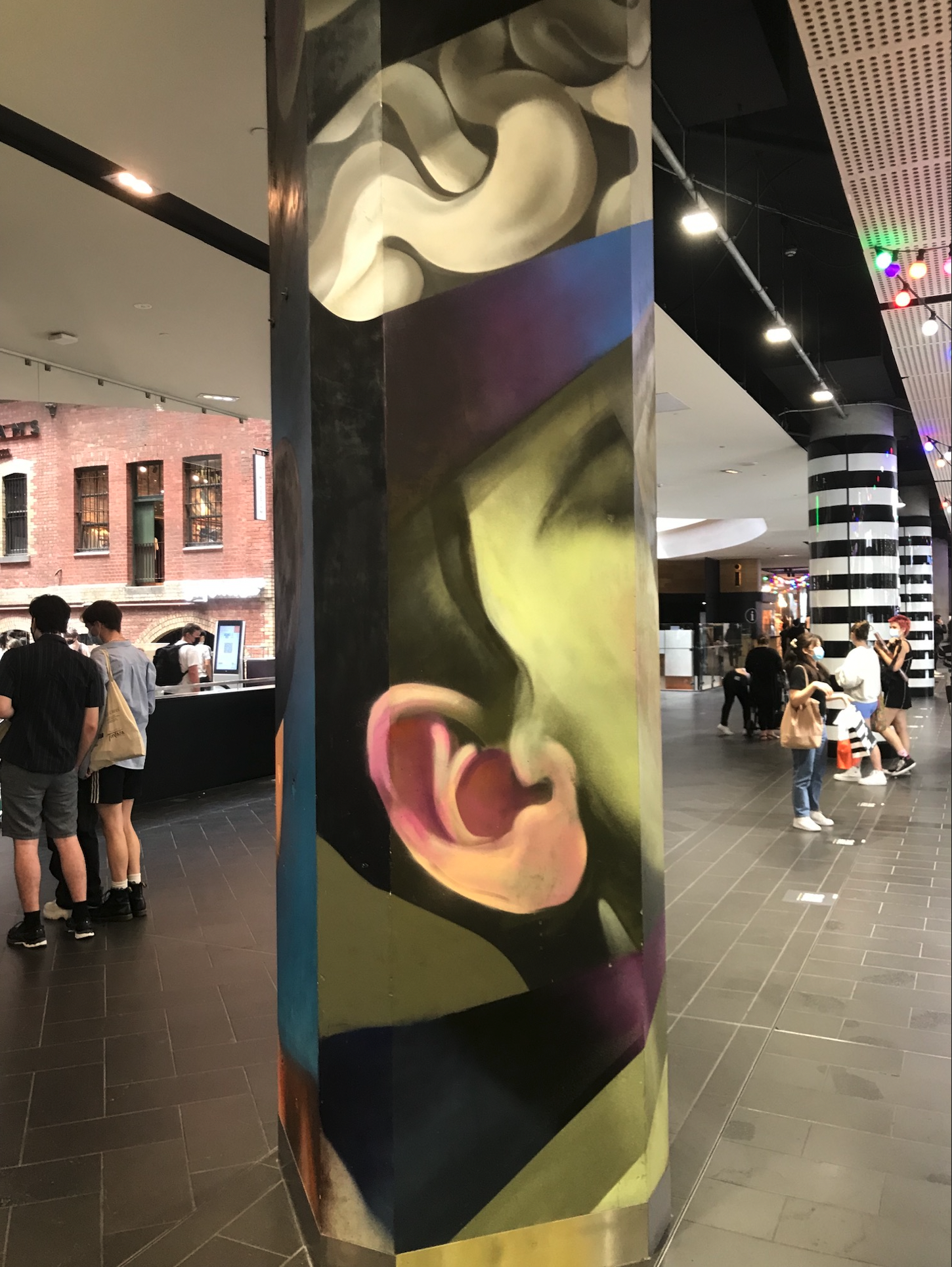
Farmer retired from painting a few years after her reports went unnoticed. She returned to painting decades later when, in 2019, Epstein’s prosecution finally gained momentum. One was a chilling canvas mural—symbolist but still utilising realist technique—that depicted a nightmare narrative of being embroiled in Epstein’s exploitative manipulations and sexual abuse. Then there’s a suite of around a dozen portraits in crayons of the survivors who over the preceding decade had also attempted to report Epstein’s activities to law enforcement. These artworks are entirely lacking in anything that could fit the bill for Contemporary Art: they are realistic yet textured in Van Gogh-like line swirls; the women appear to have posed identically for an official portrait; the overall tone is one of therapeutic brightening rather than gloomy introspection. Massively enlarged, they could blend in with the near endless supply of pretty women that commissioned street mural artists love (Rone, Adnate, Guido Van Helten, et al). Kept at their original size, they would likely gain entry into The Archibald Prize. One thing is for certain: regardless of their #metoo provenance, it is highly unlikely that they will be considered Contemporary Art.
If skill, craft and perfection in presenting “life-like” objects, images and actions are excluded from Contemporary Art discourse, it seems logical that CA would direct its energies to the contexts within which the representation of “life” can be levered to critique, intervene, revise, activate and repurpose artmaking under conditions claimed to define late twentieth century culture. Yet the catalogue of works that have performed this way for the last thirty years essentially illustrate those concerns without recourse to representing them. On one hand, the contemporary artist is mandated to perceive what is going on in life to make a statement of its current conditions—but on the other hand, they are dissuaded from simply painting that view in a life-like way. Is it because you would be accused of reviving Napoleonic History Painting? Of allowing the privileging of your skill to interfere with political commitment? Of utilising outdated tools or childish methods unsuited to the serious argot of curatorial branding? Of producing an image that anyone could easily and instantly understand?
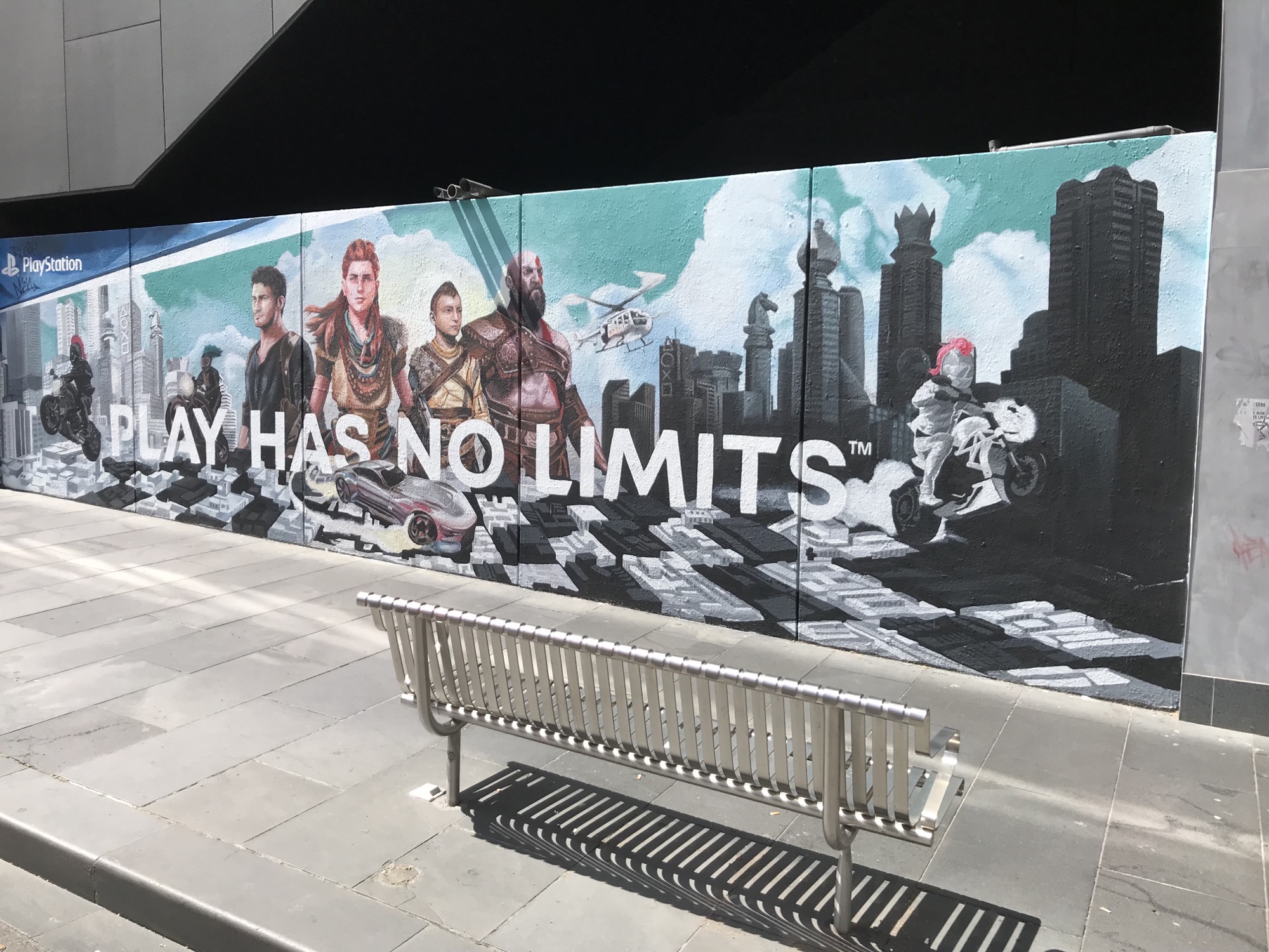
I have no answers for this, but the continually changing Latrobe Street commercial murals activate my thoughts on these matters with greater force than pretty much any curatorially authored assertion of Contemporary Art. Tellingly, Melbourne Central since 2015 has been running a blog with multiple “arts” and “creatives” sub-sections; but while they cover people doing “art” inside the building, they have never covered the commercial mural artists working outside on its walls. Figurative or mimetic representation that bears an illustrative function is unlikely to achieve the theoretical potential I’m fantasising about—especially when moribund institutions like ABC TV moves into its sixth season of the most insulting celebration of realist portraiture, Anh’s Brush With Fame (2016–). While that show, its personnel and its platitudes induce nausea in me, I feel a mild transcendental ping when staring into the brushwork of JB Hi-Fi’s Final Fantasy XIV mural. The plastic life-likeness of the painting excites a reversal of the Stendhal Syndrome: its “beauty” does not trigger a panicky psychosomatic response but rather seduces me to enter the scenography of the painting’s illusionism. Then again, maybe I’m already inside that world: all realist painting might be showing us what it is to look out to the world from inside art’s hermetic universe.
Philip Brophy writes on art among other things.
